We’re not short on type in the CCA shortlisting
As the Creative Circle announced their nominees for 2023, we raised our glasses to celebrate eight Kontrapunkt projects. One glass was raised for our community-building coffee characters made for Chamberlain Coffee. One glass for the bold logo created for the beautiful junction of beer and cycling enthusiasts. One glass travelled east, west and back again following the travel agency Veltra in their rebrand. And a stunning total of five glasses were raised for our type department and everyone involved in crafting quality type designs for Faurschou, TASAKI, Spillerforeningen, Coop 365discount and Superb. A huge congratulations to everyone nominated.
The Dossard Rouge
Logo – PAS NORMAL Studios x Carlsberg Research Labs
Crafting the logo for a new collaboration was challenging, not least because it was between two well-established brands, each distinct and instantly recognisable.
The design challenge was to create something entirely new, yet anchored in heritage, representing both the Carlsberg Research Laboratory and cycling-apparel brand Pas Normal Studios.
To mark this courageous partnership, we developed a combined logo using the iconography of both brands - Carlsberg's distinctive hop leaf and Pas Normal's utilitarian logotype. They work seamlessly together in an elegant logo, whilst being designed with future collaborations in mind.
Creating a new identity one anagram at the time
Rebrand/Corporate identity – Veltra
Travel. Veltra. Anagrams tap into the reader’s sense of surprise by presenting what is already in front of them in a new way. This is indeed what has happened with the rebrand of the Japanese travel agency Veltra.
“Veltra’s worldview inspired us to create a dual wordmark. In a clever yet effortless way, it symbolizes how a harmonious fusion of different perspectives can foster greater understanding — and help us experience the world differently.” — Emil Andreas Bruun Sørensen, Strategy Lead Japan
Respecting heritage
Type design – TASAKI, Spillerforeningen, Faurschou, Coop 365 discount, Superb
Whether it is the original font, the history of handwritten signs or the culture and style embedded in your favourite football shirt, every single type design nominated for this year’s CCA is made with respect for heritage.
Faurschou
“The outset has been to supplement the original and very expressive Faurschou font with a family that can excel on touch points where the original font was just a bit too loud. By stripping the original Faurschou font — yet maintaining the same proportions — we made a functional and geometric design to pair seamlessly with the old font. This ‘restoration’ so to speak, has now enabled Faurschou to take the gallery experience into the virtual exhibition room — being it logo and headlines or smartphone and title cards.” — Torsten Lindsø Andersen, Head of Type Design & Partner
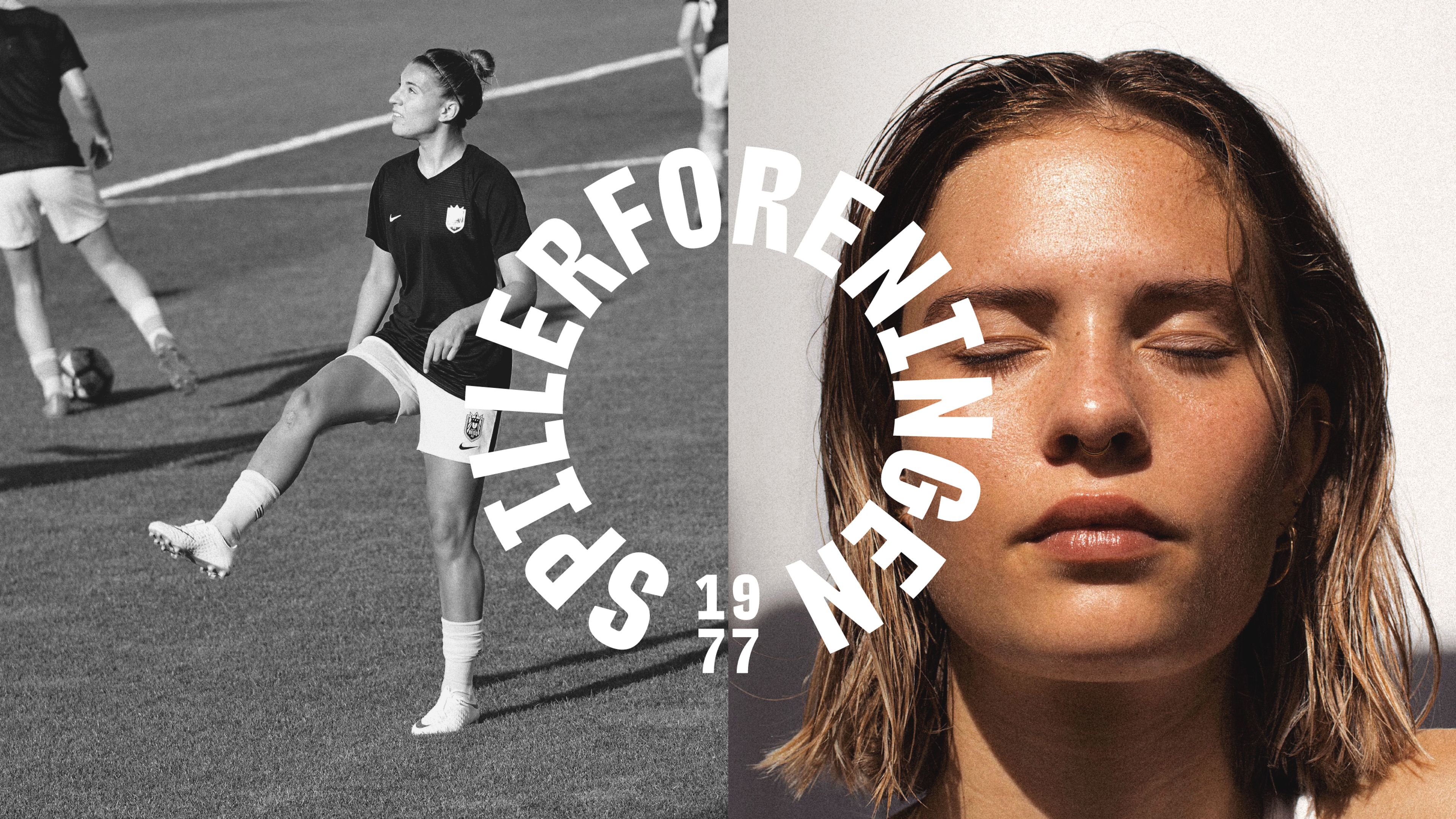
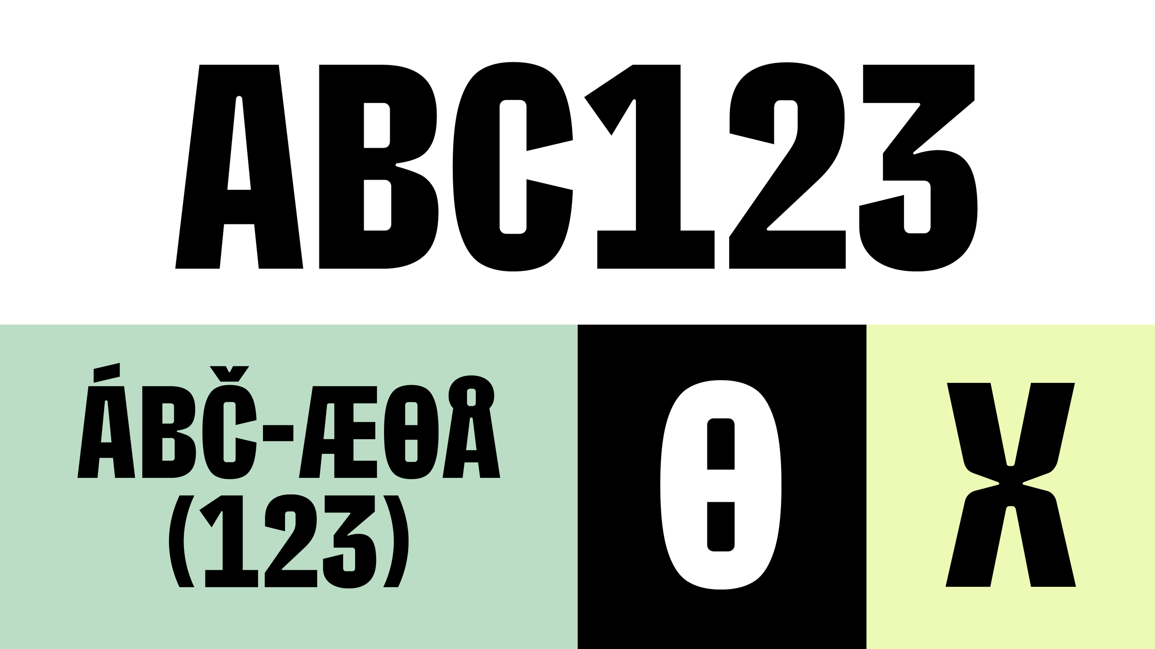
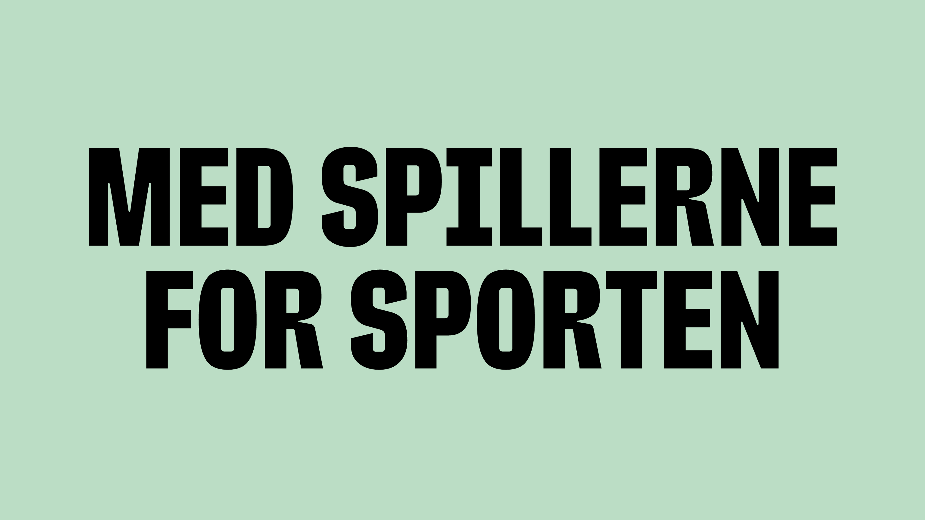
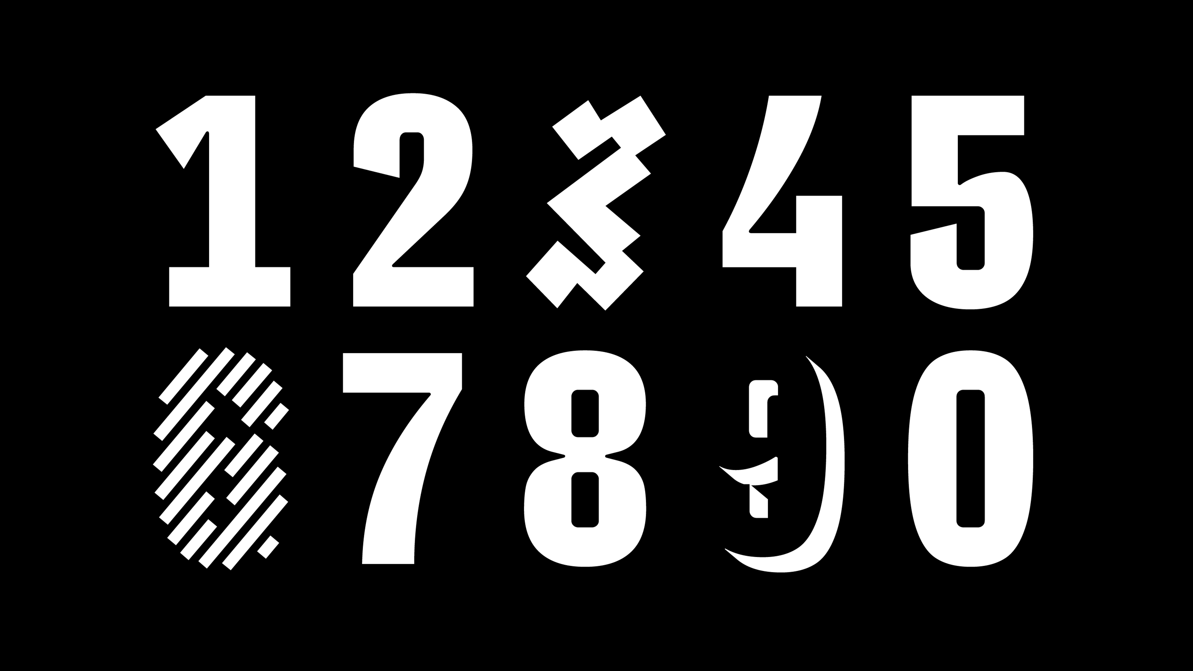
Spillerforeningen
“We are very inspired by the diverse and expressive visual history of football jerseys, especially the numbers on the back. With a narrow and massive design — carrying quite a lot of features and additional numbers — the font for SPFO aims to translate a unique visual culture into a font for the digital era.” — Rasmus Michaëlis, Head of Type Design & Partner
/
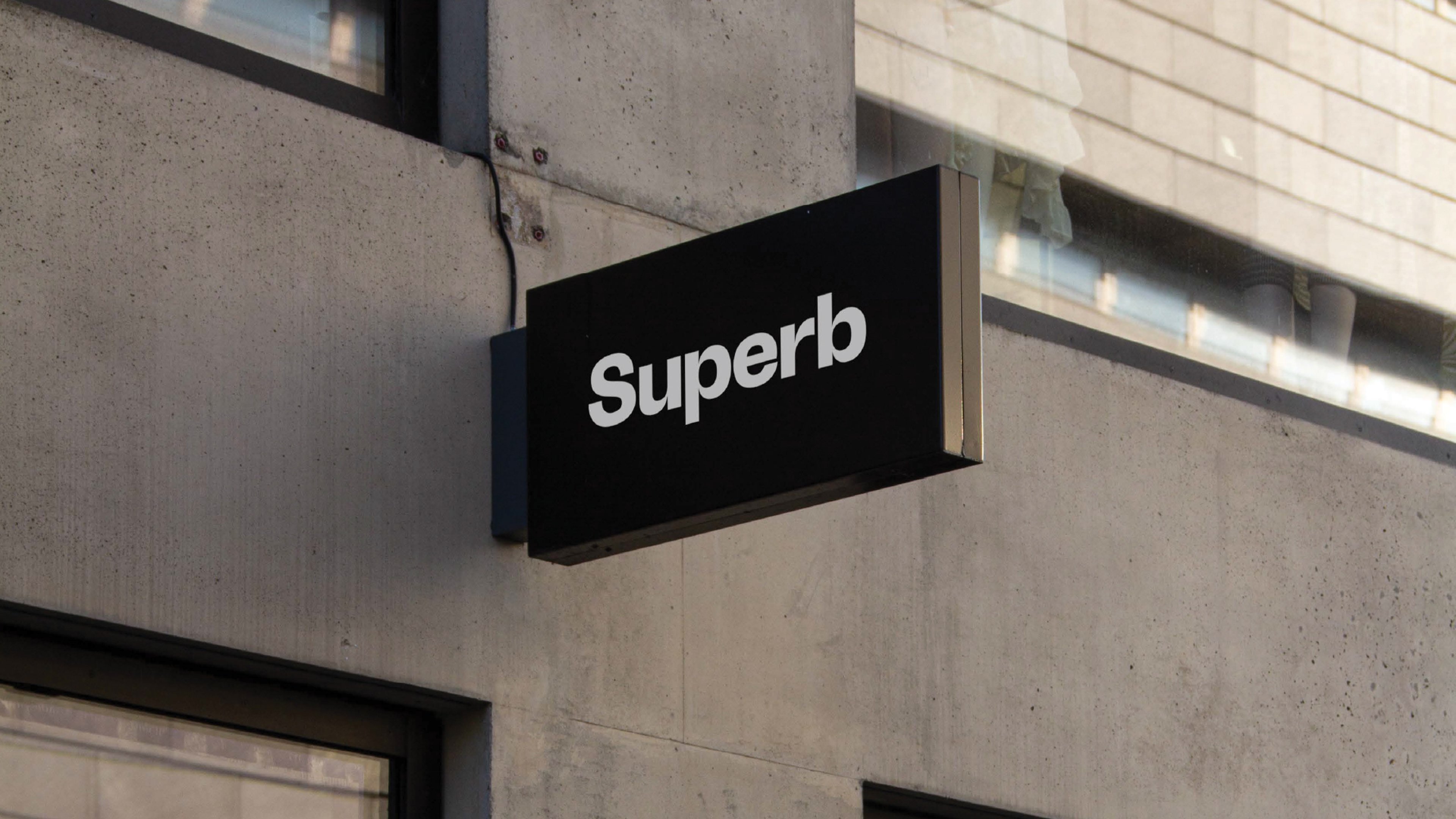
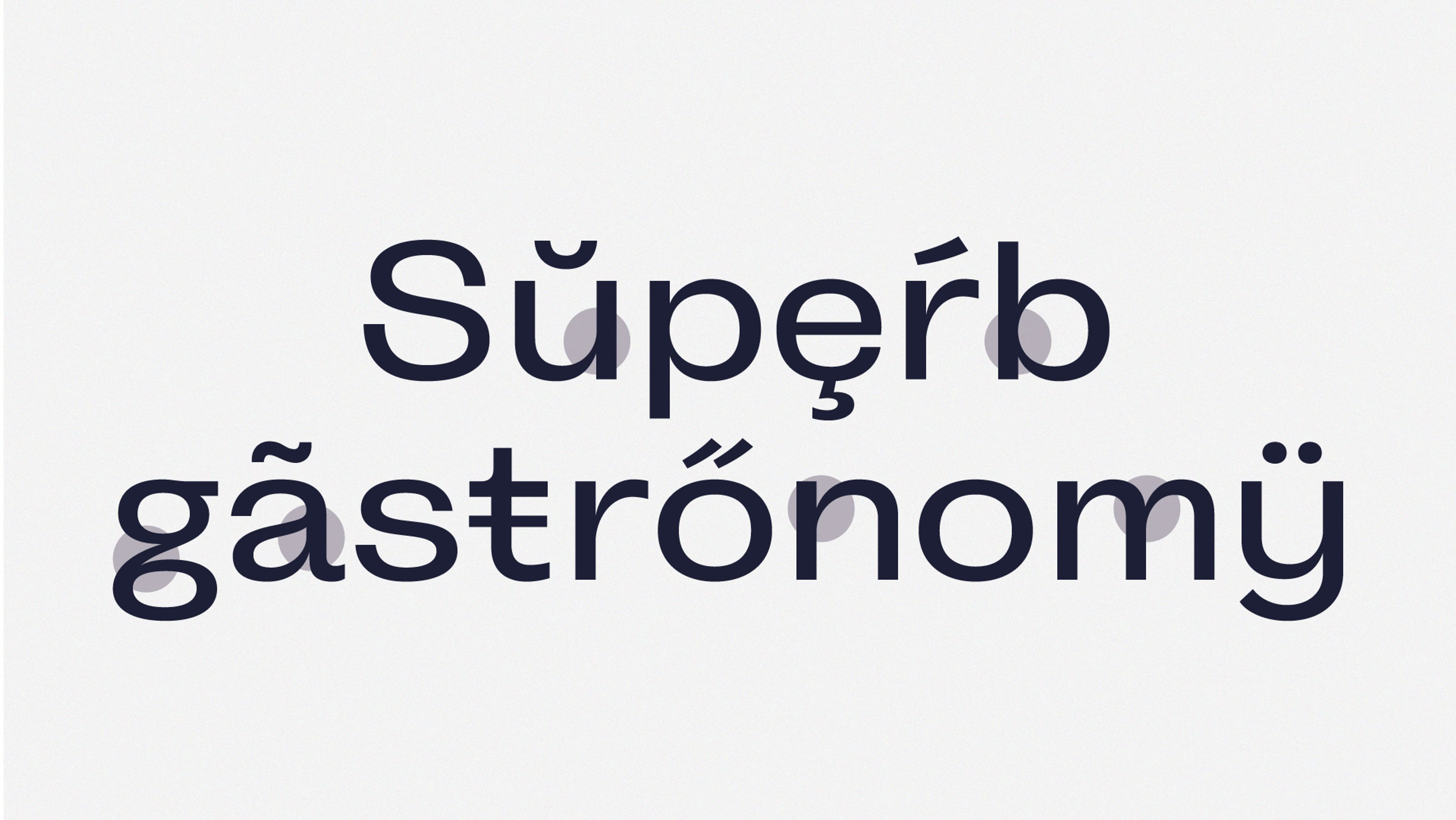
Superb
“We imagined a font that visually imitates the hosting experience — warm and personal, but not intruding. To put it in short, we wanted it to become an appealing basic font with just a bit of flavour.” — Rasmus Michaëlis, Head of Type Design & Partner
/
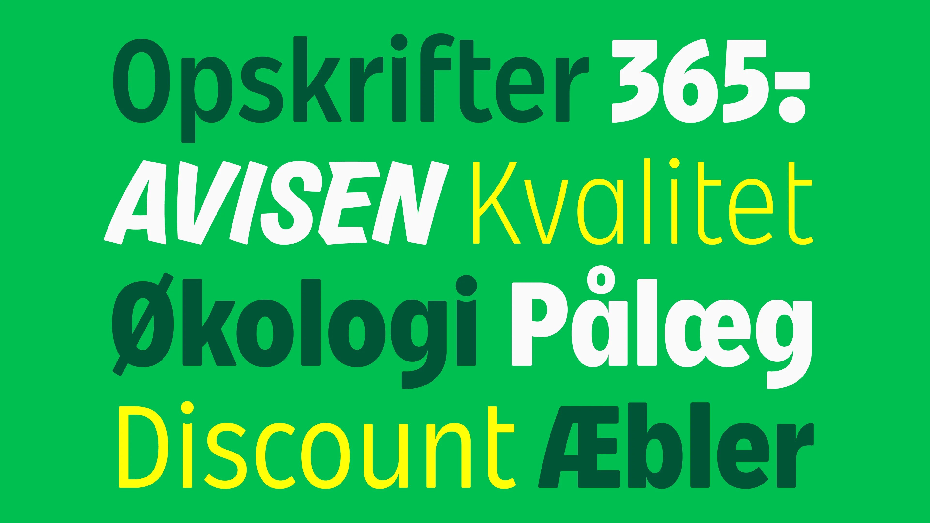
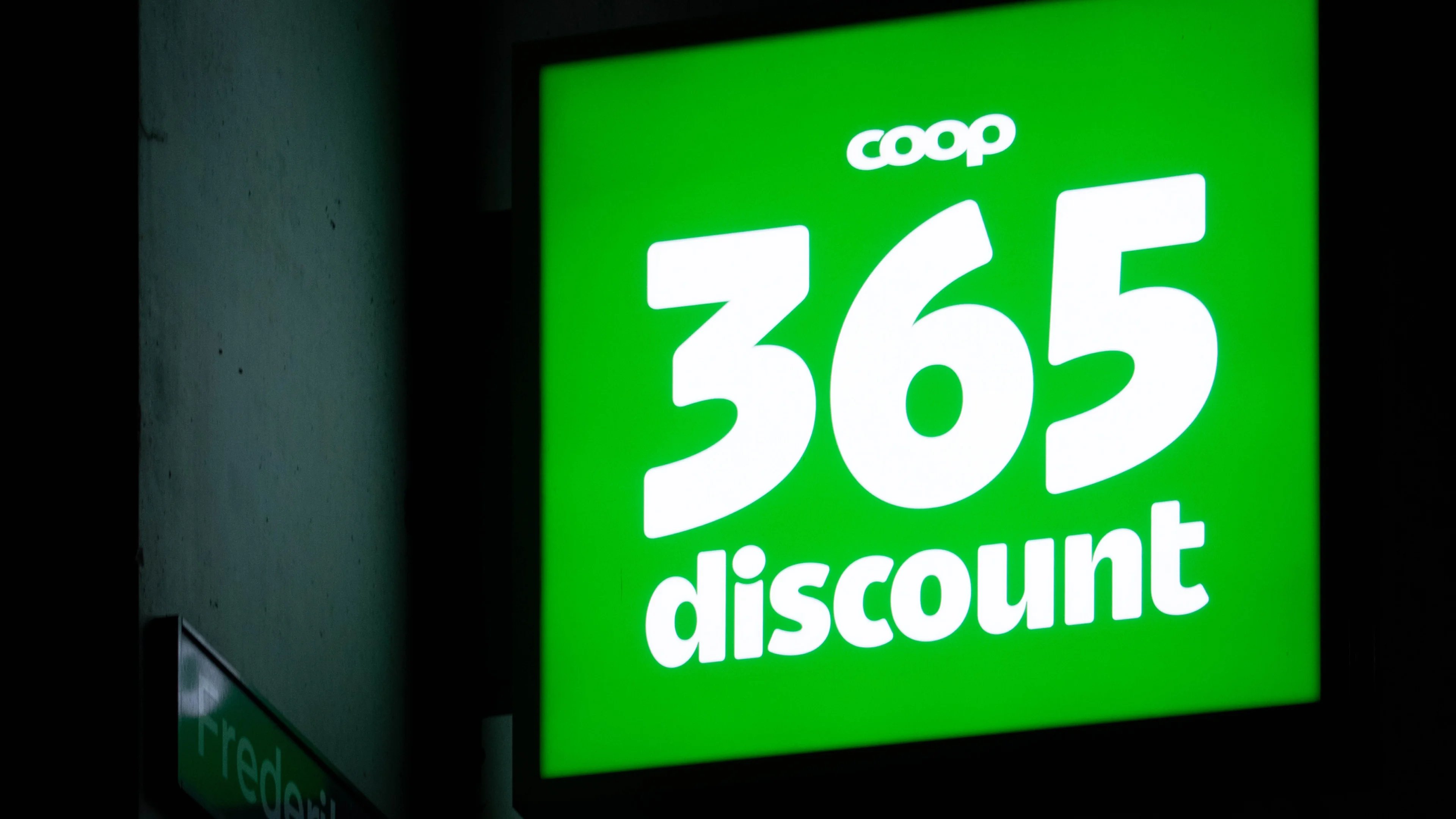
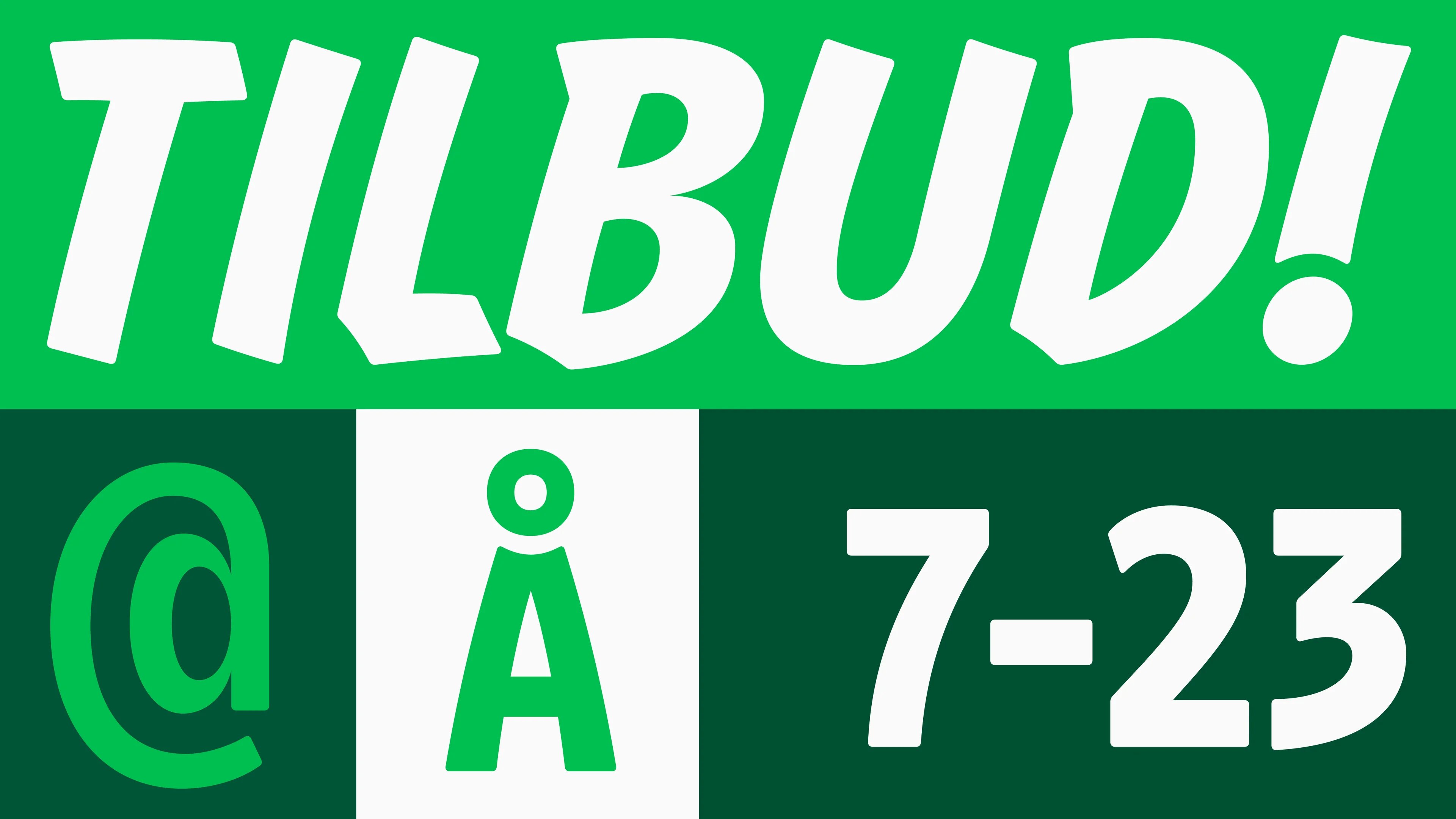
Coop 365discount
“For the typeface for Coop’s discount supermarket ‘365discount’, we took inspiration from the heritage of handwritten signs — typically quickly made up with a fat marker or flat brush — often used to advertise for the ‘daily offer’. We wanted the font to ooze of an unpretentious yet proud discount vibe to reflect the craftsmanship and care of retailers.” — Torsten Lindsø Andersen, Head of Type Design & Partner
/
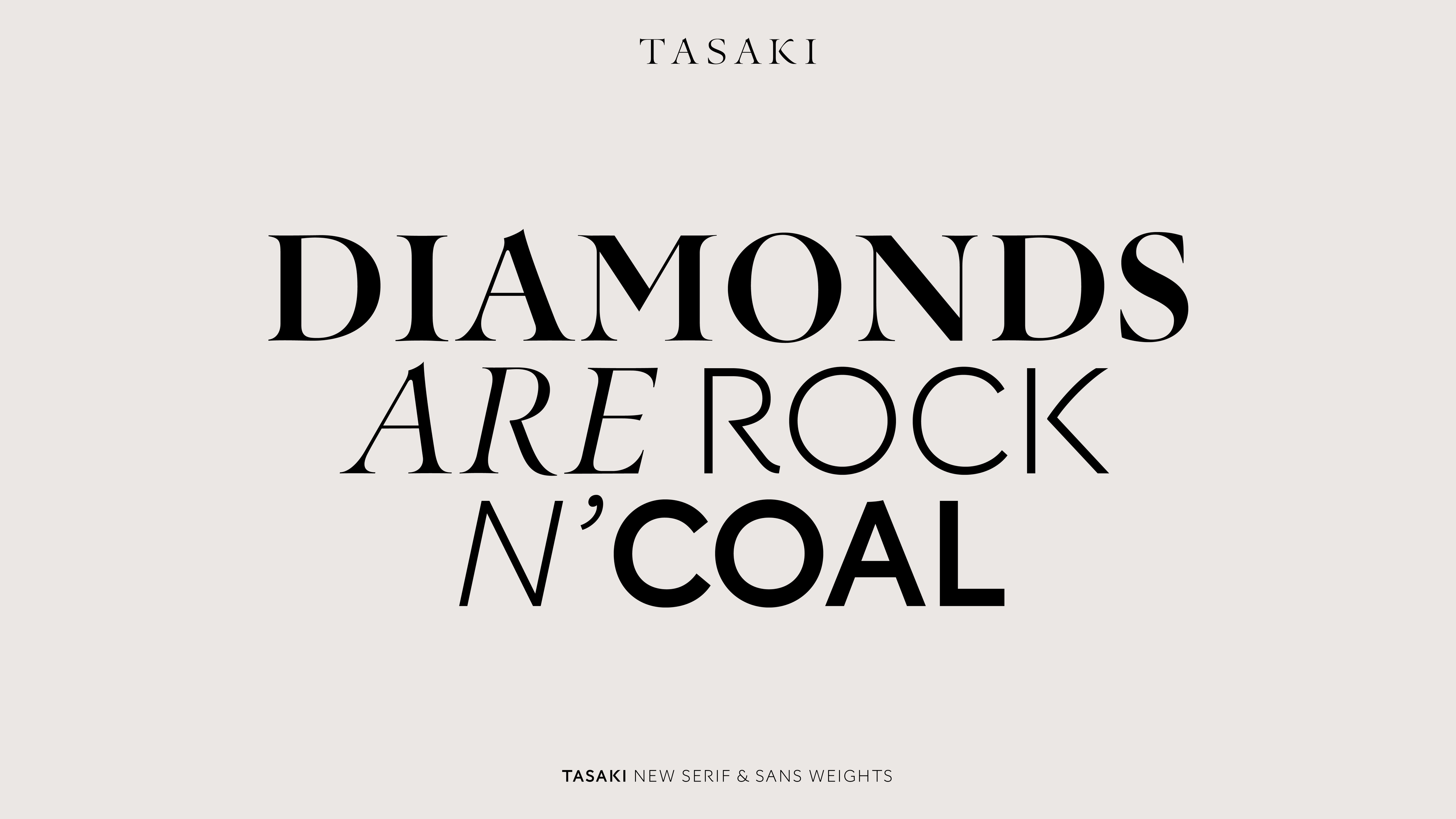
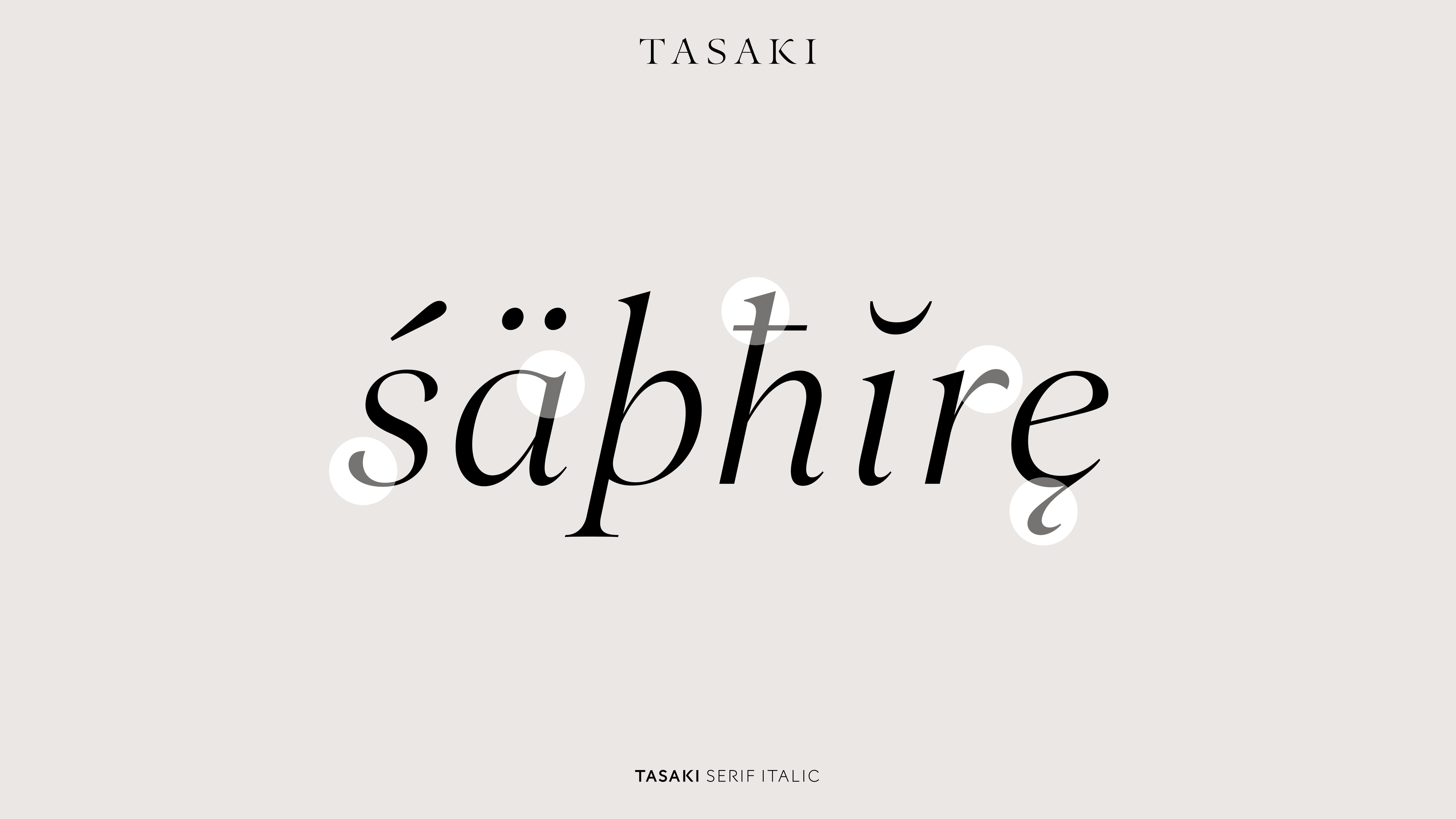
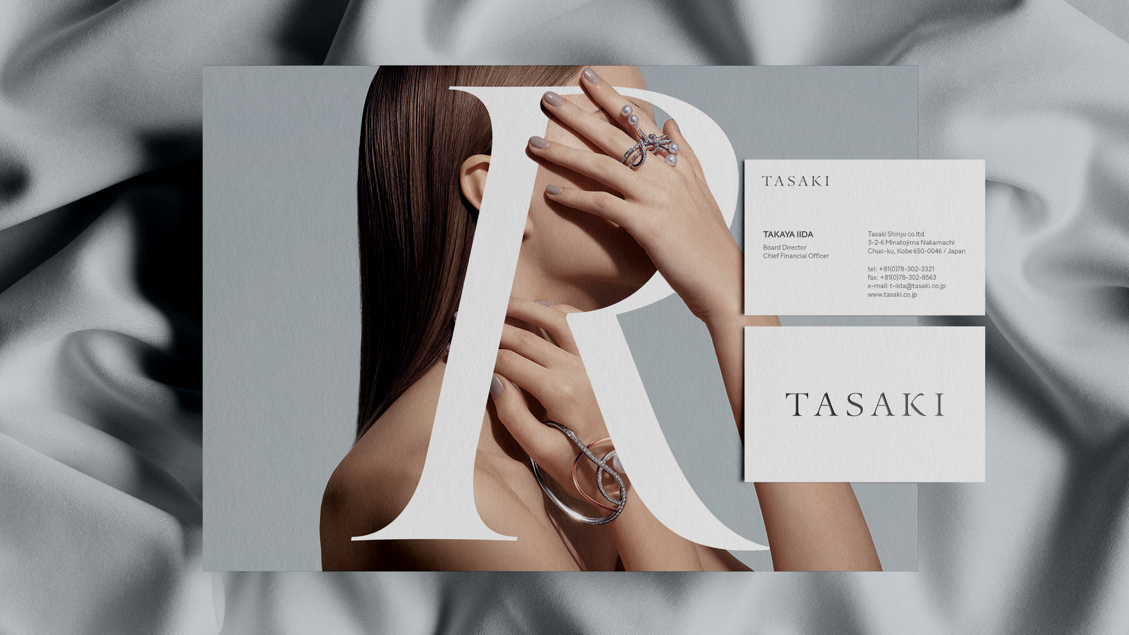
Tasaki
“To meet Tasaki’s wish to use their brand font everywhere, we extended the original Tasaki serif typeface with more weights and styles — including a sans serif family guaranteeing a versatile typographic toolbox in harmony no matter the style or purpose. The original Tasaki serif typeface has a delicate finesse inspired by Japanese calligraphy that we have aimed to interpret in the sans weights balancing high-end with a contemporary expression. We find it amazing how the DNA of a font can keep evolving and be translated into so many different genres and styles over time.” — Torsten Lindsø Andersen, Head of Type Design & Partner
/
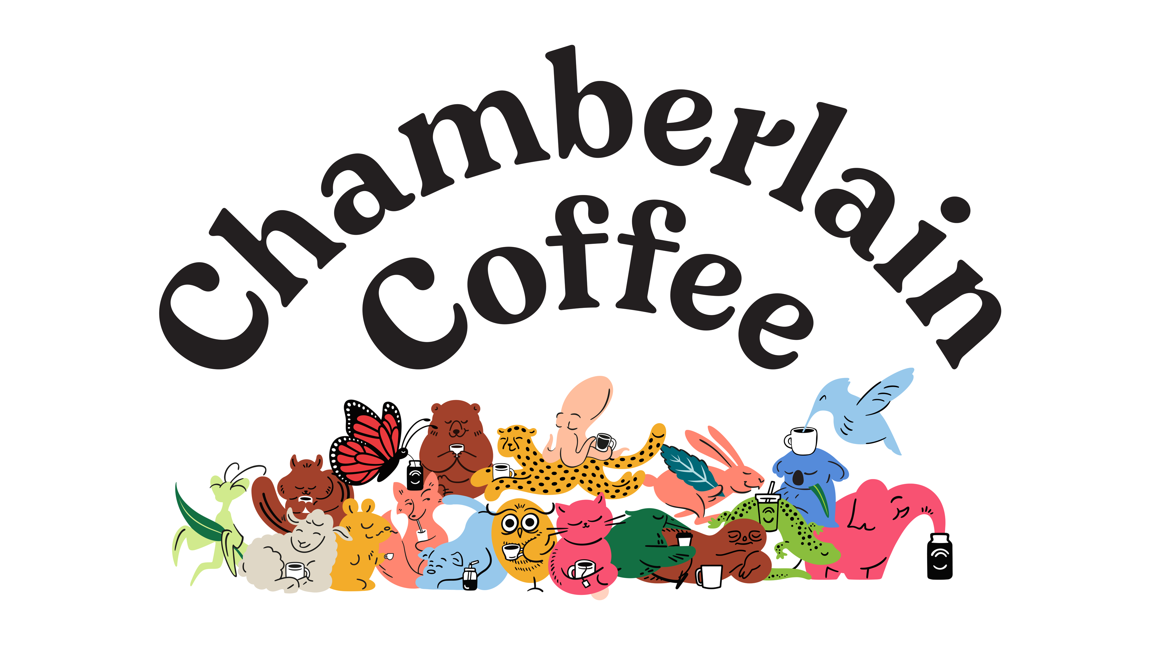
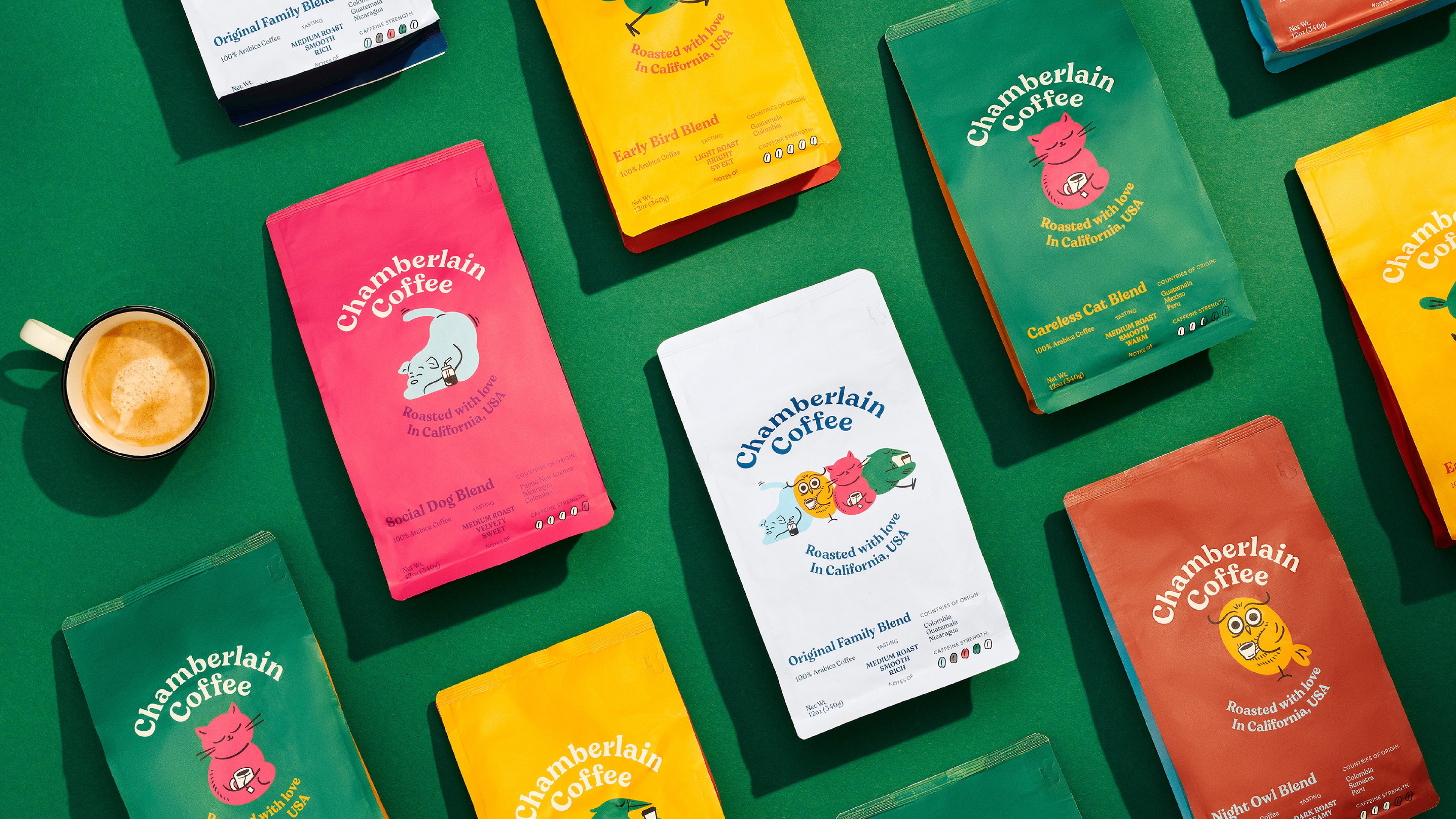
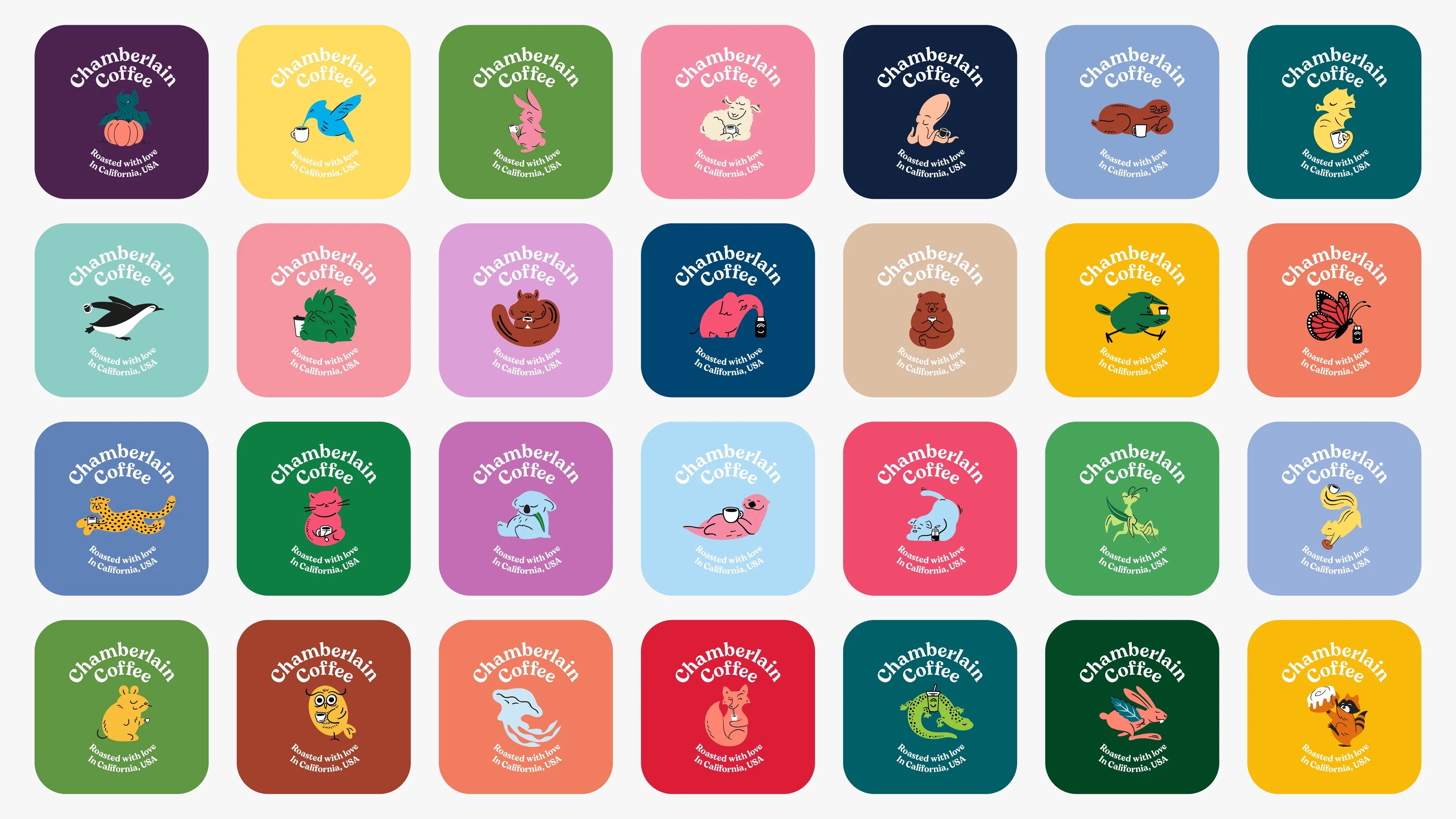
Creating a character-driven coffee community
Craft/Illustration – Chamberlain Coffee
Only three years ago, Emma Chamberlian, the renowned Youtuber and Influencer, kicked her way into the coffee scene, winning over an entire generation. Chamberlain is coffee made into a brand. And not any other brand. It is a community of characters creating a new fun universe where quality doesn’t correlate with dusty. The rich and colourful illustration style supporting the different playful characters encourages a unique view of the industry — creating a Gen Z community of coffee lovers.
/
To wrap it up
- Logo: PAS NORMAL Studios x Carlsberg Research Labs
- Rebrand/Corporate Identity: Veltra
- Type design: TASAKI, Spillerforeningen, Faurschou, Coop 365discount, Superb
- Craft/Illustration: Chamberlain Coffee
Learn more about the case

A pension company that puts people first
