Designing Beyond the Binary

Bridging Queerness and Design
People who identify as queer have more than likely struggled with their identity at some point in their adolescence. The heteronormative surroundings we all grew up in suggest, even today, specific behavioural patterns and prototypical identities as “agreed-upon norms” and categorise other behaviours as non-normative.
It comes as no surprise that those who want to fit into society’s predetermined stencils are constantly asking themselves how they are being perceived by others. I asked myself that question many times and as a visual communicator, I wonder:
How do people perceive not only me but my design? Does my sexuality and gender play an intrinsic role in my design work? What is my position and responsibility as queer Graphic and Type Designer?
In the course of investigating the dialogue between queerness and design, these questions led to my empirical research.
Visual Stereotypes
The empirical research has shown that, when asked about design works, in most cases people aren’t able to detect the gender and sexuality of the designers. Rather, their feedback is heavily based on stereotypes linked to colours, textual content, motif, and typography. The assumptions around a specific design are, in other words, most commonly rooted in stereotypical visual appearances. In spontaneous assumptions based on imagery. It helps us reduce the complexity of social structures, so we can be free from the constant reassessment and reevaluation of people, groups or objects. We are aware that stereotypes are not an adequate representation of the person or group that is being described, yet we perpetuate them by participating in their use.
Being aware of this, the relevance of stereotypes in the field of visual communication design is inherent. Not only when it comes to gender and sexuality — but within all categories where we tend to use stereotypical images as a foundation for discrimination.
A quick observation of typographic conventions around us shows the stereotypical gendered visual appearance of brands. If we take a look at fashion magazines like “Vogue”, “Elle” or “Harper’s Bazaar” we can identify the use of high contrast classicist serif typefaces. Those typefaces usually have soft, drop-like shapes, tender and light strokes, ornamented and round bodied details, that are often assigned to femininity.
Sharp, bold, wide and angular letter shapes on the other hand are often connected to stereotypical masculinity — as we see it in logo types in the automotive industry.
Design Bravery and Activism
The learned connections of visual characteristics and genders are simply a result of tireless repetition and are — just as gender roles and sexualities — an invented reality that can be deconstructed. If we stop thinking about visual characteristics being linked to gender, we can deconstruct them.
It is evident that typography is one of the most powerful elements in graphic design and is the ubiquitous aesthetic expression of language. Consequently, as a type designer, I can have an influence on language. Language, in spoken as well as written form, is a source of discrimination and plays a central role in the discourse around equality and tolerance. Meaning that designers — and all visual creators — possess the power to influence and shape their audience’s ideology. Graphic design can therefore be an activistic force.
Should we as designers take the role of leading into the future by collectively and aggressively forcing new, inclusive, anti-stereotypical visualities and act as dominant educators?
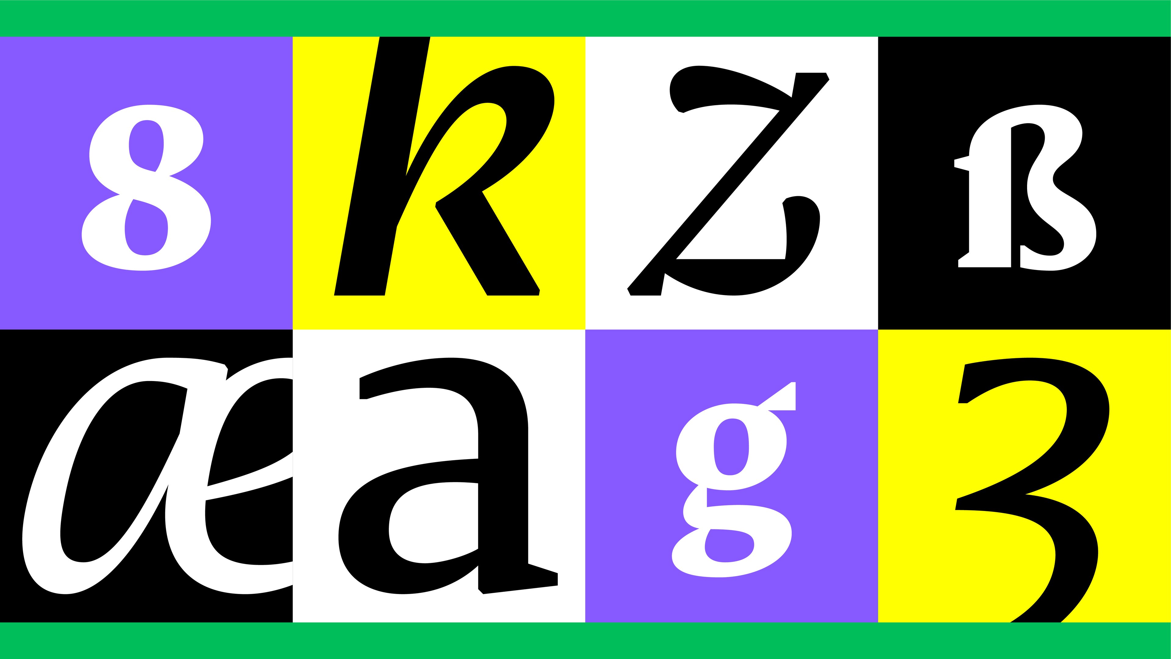
Taking on this responsibility myself, I tried to create a variable space that is opposing the stereotypical and tried to escape the binary — by providing the theoretical and empirical research with a visual translation and proposing design-activistic solutions.

My Visual Proposal
The concept of my visual research in the realm of type is constituted in the origin of the word “stereotype”. It derives from Greek (stereos = rigid, stiff; typos = impression) and was first used by the printer Firmin Didot. It describes a printing plate that duplicates any typography, which is used instead of the original — it is a solidified, unchangeable cast. If we were to break fixed connotations, we must then create a variable space that is opposing the “stereotypical”.
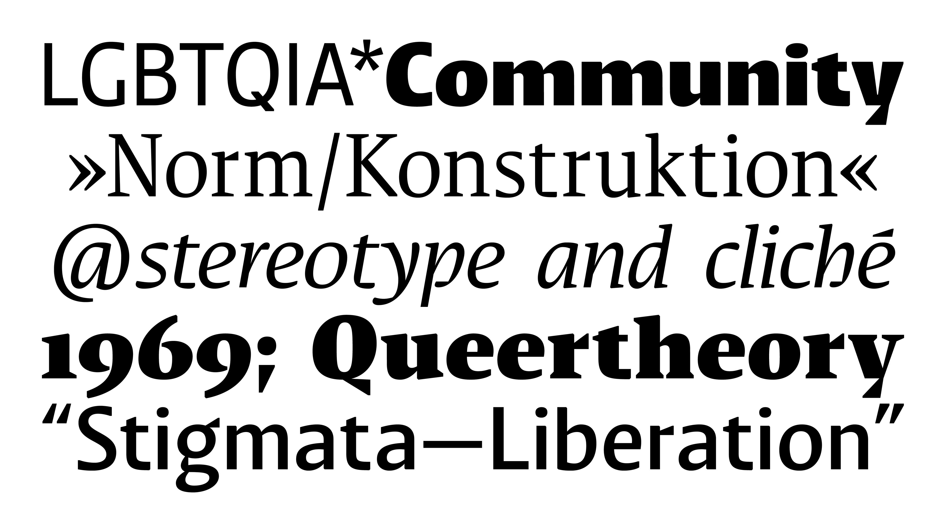
A variable typeface that links back to the etymological origin of stereotypes and creates a directly opposing character. A typeface that is flexible, dynamic, and diverse. A visual destruction of the binary.
The three axes (serif shape, weight, slant/true italic) open up a typographical space and dimensionality that represents the complexity of sexuality and gender more suitably than a one-dimensional, binary spectrum. But why is the model of a binary spectrum flawed?
Limits of Non-Binary Design
In everyday discourse, sexuality and gender are often understood on a binary scale, which is a problematic framework. The first part of a binary always defines the terms of the discussion, acts as centre and is immune towards being questioned and discredited. We endlessly discuss the role of women but not of men, homosexuality but not heterosexuality, being black not being white. And in terms of gender and sexuality the binary simply isn’t broad enough, as many people identify themselves beyond the binary.
To avoid shape-specific connotations that link to either stereotypical femininity or masculinity, I tried to combine both rounded and angular/sharp-edged shapes.
Unfortunately as designers we can’t escape the binary of round and angular shapes, everything we design is either of those or on a binary spectrum in between. Visualising freedom and representation in countless shapes is limited, as designers are always the ones setting the shapes and defining the borders of the variable space they create.
Hence the visualisation of my theoretical framework is limited by the confined nature of design. It serves as a proposal and an argument for more nuanced design, rather than claiming to be a solution to the question of non-binary, diverse and anti-stereotypical design.
Nevertheless, it still raises a central question. Are there possible ways to deconstruct the way we reuse stereotypical structures in our design? And aren’t we recipients as well as designers bored after seeing the same typography conventions for decades, just because no one is brave enough to break with established connotations?
We probably need to discard those connotations first to move society towards a more equal future. Drop our cultivated connotations of gender and sexuality. And subsequently thrive for a reality where all design is queer or queer design doesn’t exist at all.

