Evolving Family Structures: A typographic translation of familial relations
Family. An ever-changing tale of changing structures between individuals in a relationship. In this particular tale, we’re looking at the familial relations between humans and how those can be translated into a typographic concept – asking how we can engage ourselves in a broader reconstruction of the traditional idea of family.
Typography is, at its core, the style and size of letters. Furthermore, it is communication — not only in the content it displays but in its own right. The following article elaborates on typography as a means to not only highlight but add information and act as opinionated visual commentary. By dissecting the family structures in the book “Buddenbrooks” (1901) by Thomas Mann, pluralistic typography acts as visual research on how the typographic depiction of interpersonal dynamics adds meaning and information.
Hence investigating how design decisions can curate and deconstruct content — and in this particular case — how the family as an institution, portrayed in a contemporary edition of Thomas Mann’s literary masterpiece, is deconstructed. By focusing on the visual depiction of our tale, we experience how the visualisation carries meaning in itself – and in this specific case – it raises the question:
Can we, as designers, influence content and comprehension by adopting a more pluralistic typographic expression?
A question that is invariably bound to the content concerned and its embedded sociocultural connotations. So when diving into the portrayal of the meaning of family — and precisely how it’s unfolded in the book Buddenbrooks — we first have to touch on the notion of family and the content in Thomas Mann’s family novel from 1901.
The tale of a family
Buddenbrooks tells the story of a declining patriarchal family in eleven parts, documenting rigid hierarchies, marriage politics, patriarchy, sexism, heteronormativity, and a general lack of tolerance for diversity. In other words – a construct of the family as an institution with little room for diversity. On the other hand, the concept of “family” in a sociocultural understanding constantly evolves. The heterosexual marriage, as the centre of the patriarchal nuclear family, still lives in our collective imagination of a “classic” family, yet no longer reflects our realities. The family remains a globally relevant issue, intricately tied to discrimination. However, there is a positive shift in public opinion, particularly in the case of same-sex parents, as surveys indicate a rapid change in societal attitudes.
Despite traditionalists trying to hold on to the myth of the decline of the family, it is evident that the family as an institution is not declining but merely subject to change and has always been. (Cihangir, 2021: 57 f.)
Looking at Buddenbrooks in this light, it becomes apparent that the novel reflects on the institution of family and individuality, despite its age. The unfortunate characteristics of a society portrayed in the book are relatable in many societies today, underlining the ongoing topicality of the dynamics of the Buddenbrook family.
It is a novel worth reworking and setting up in a contemporary context to bring its relevant points across to a young generation and readership. Especially in the times we currently live in, it is more important than ever to look back on history and remember the learnings we have already gained.
Controls space

Controls space
![]() /
/ ![]()
Visualising Diversity
A central point in reimagining a family novel like “Buddenbrooks”—where the family decays due to its inability to embrace its diverse members—certainly lies in emphasising the importance of individuality. In a broader sense, the change in family dynamics and the institution of family should not be equated with decline. It can be seen as a necessary transformational process that carries many positive values and benefits. An obvious way to visualise this positive perspective on transformation in a new edition of the book is the typographical illustration of this familial diversity. Typography represents, amongst other formal parameters, the heart and soul of a novel. It is a medium that, more than anything else, offers an open typographical playground — page after page.
How can we make typography display the diversity of characters?
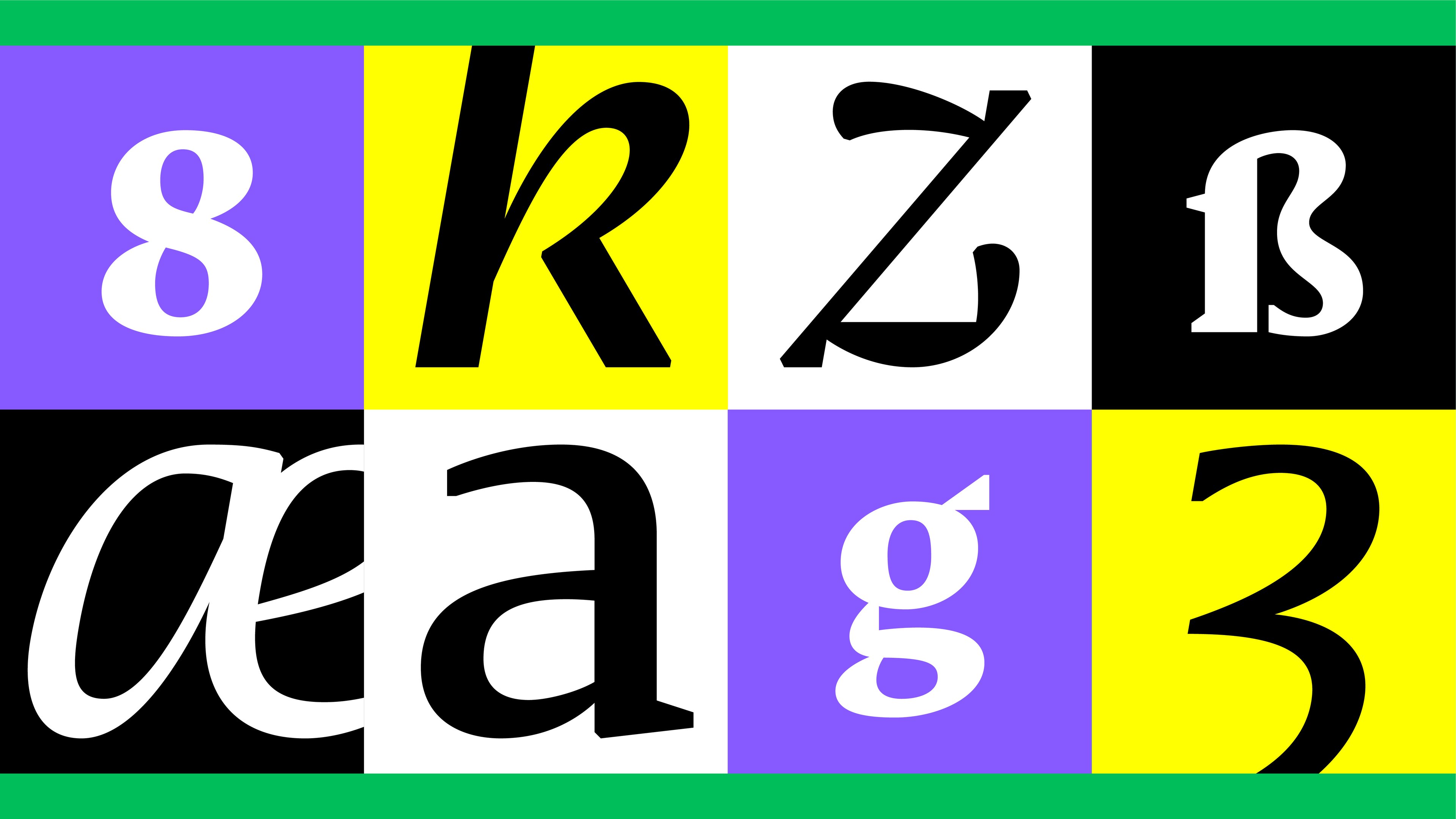
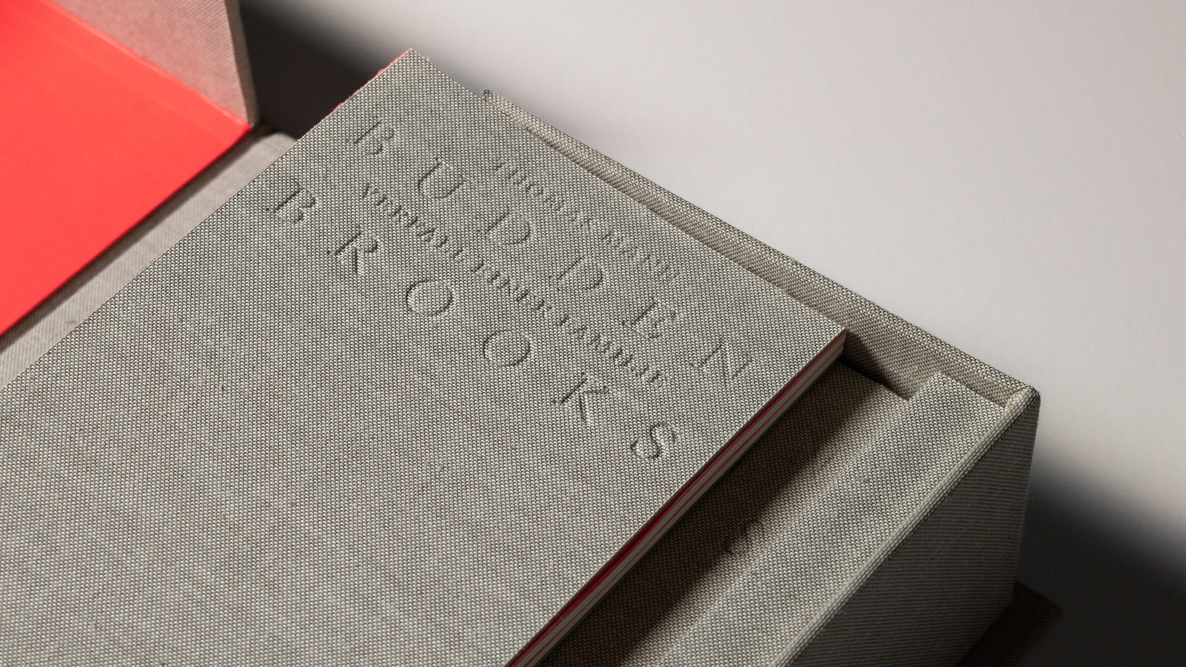
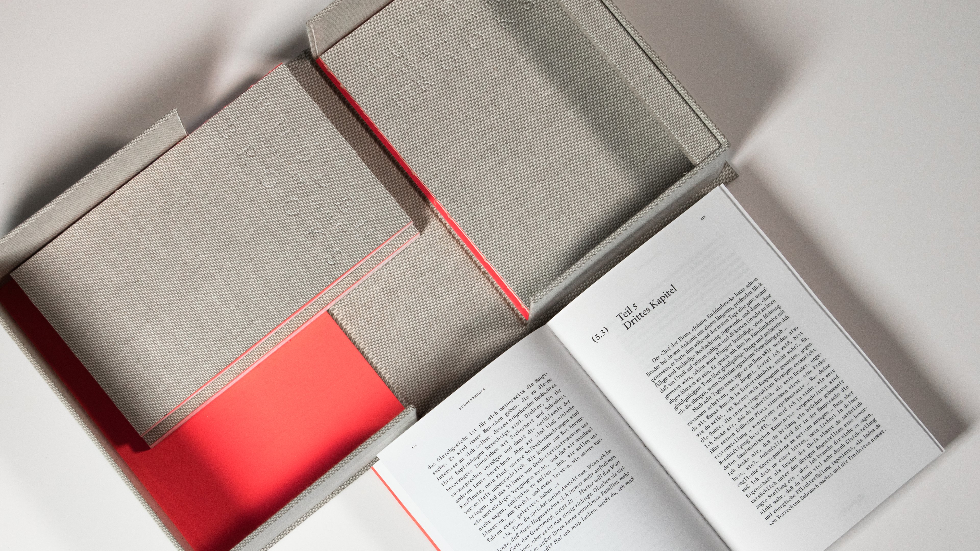
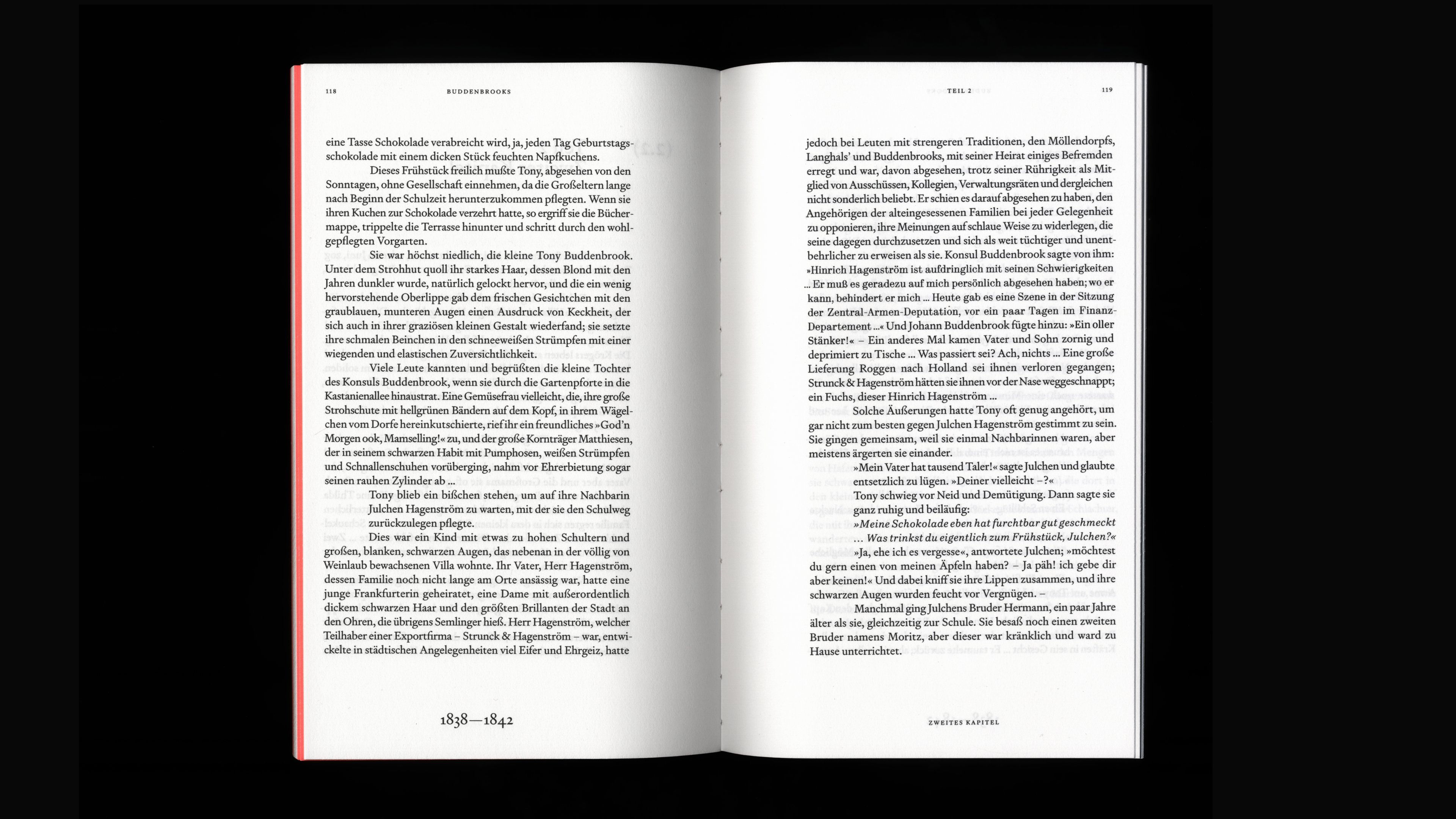
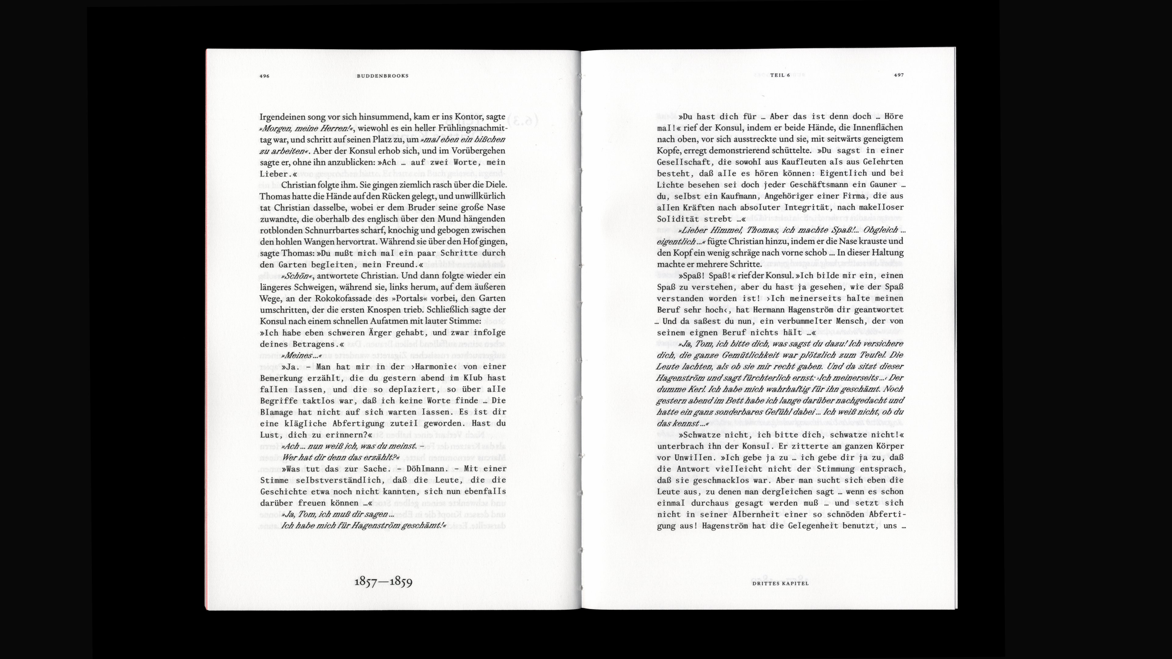
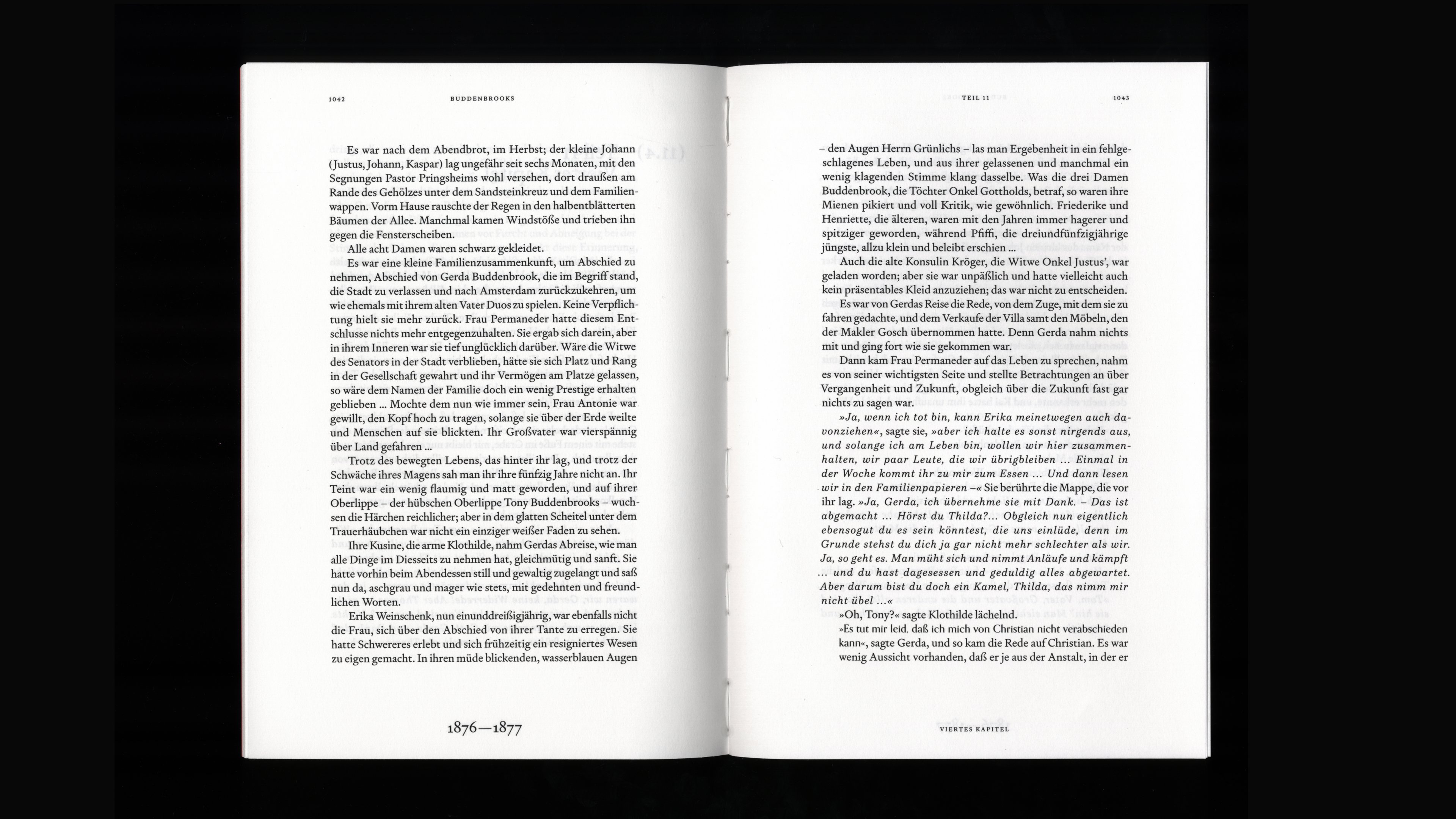
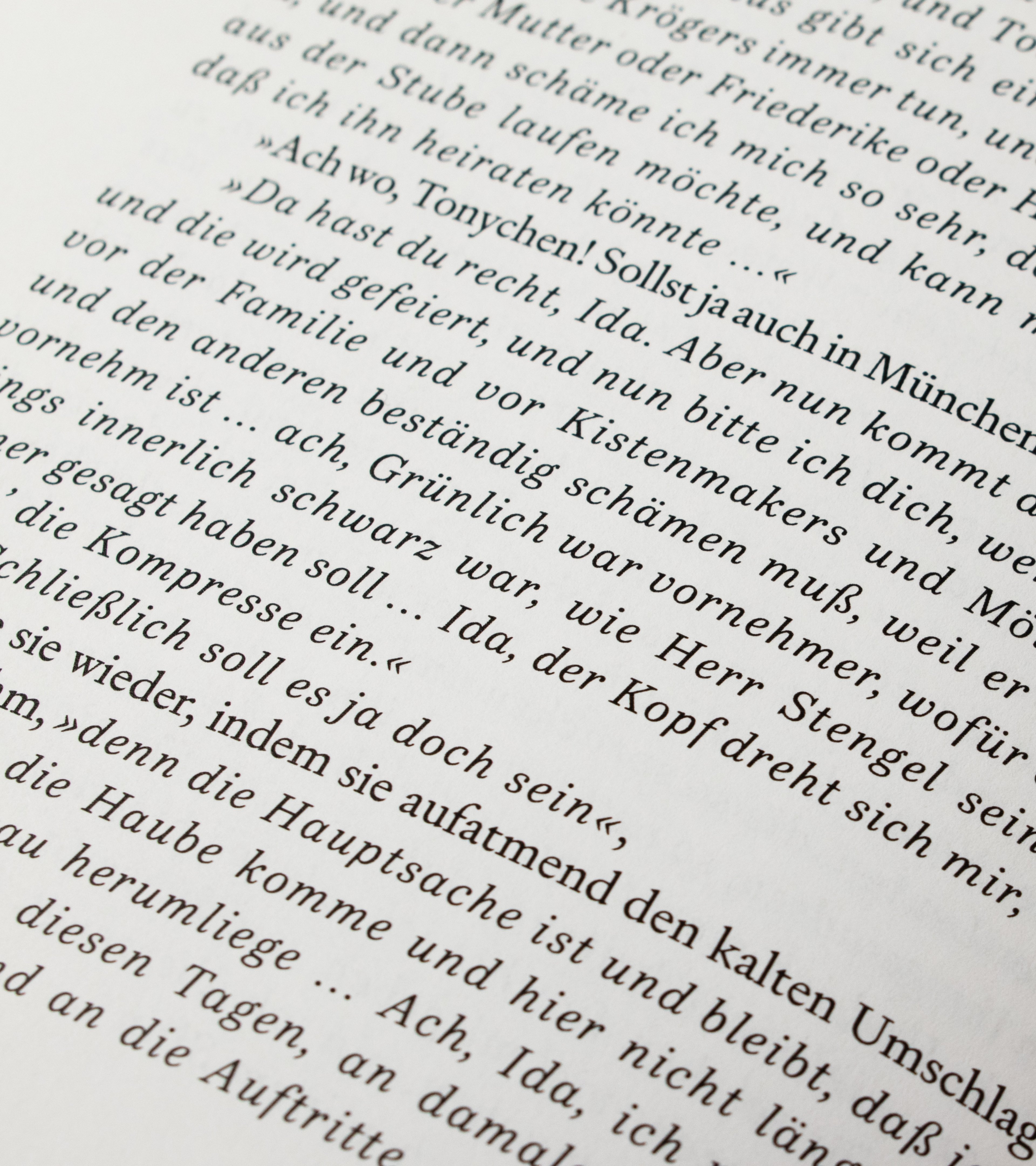
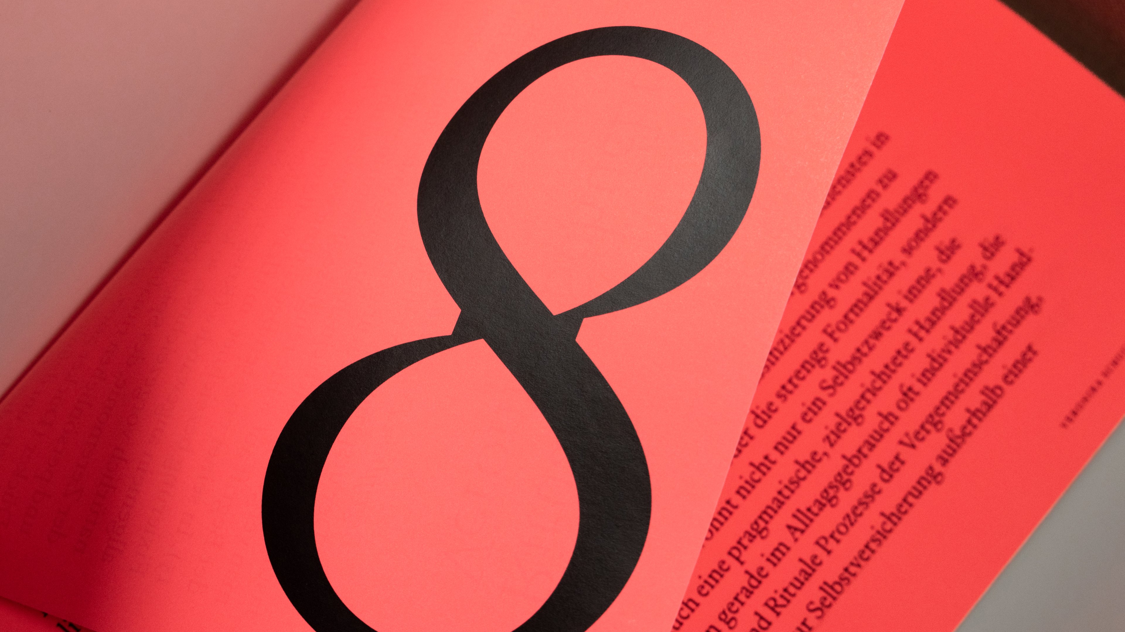
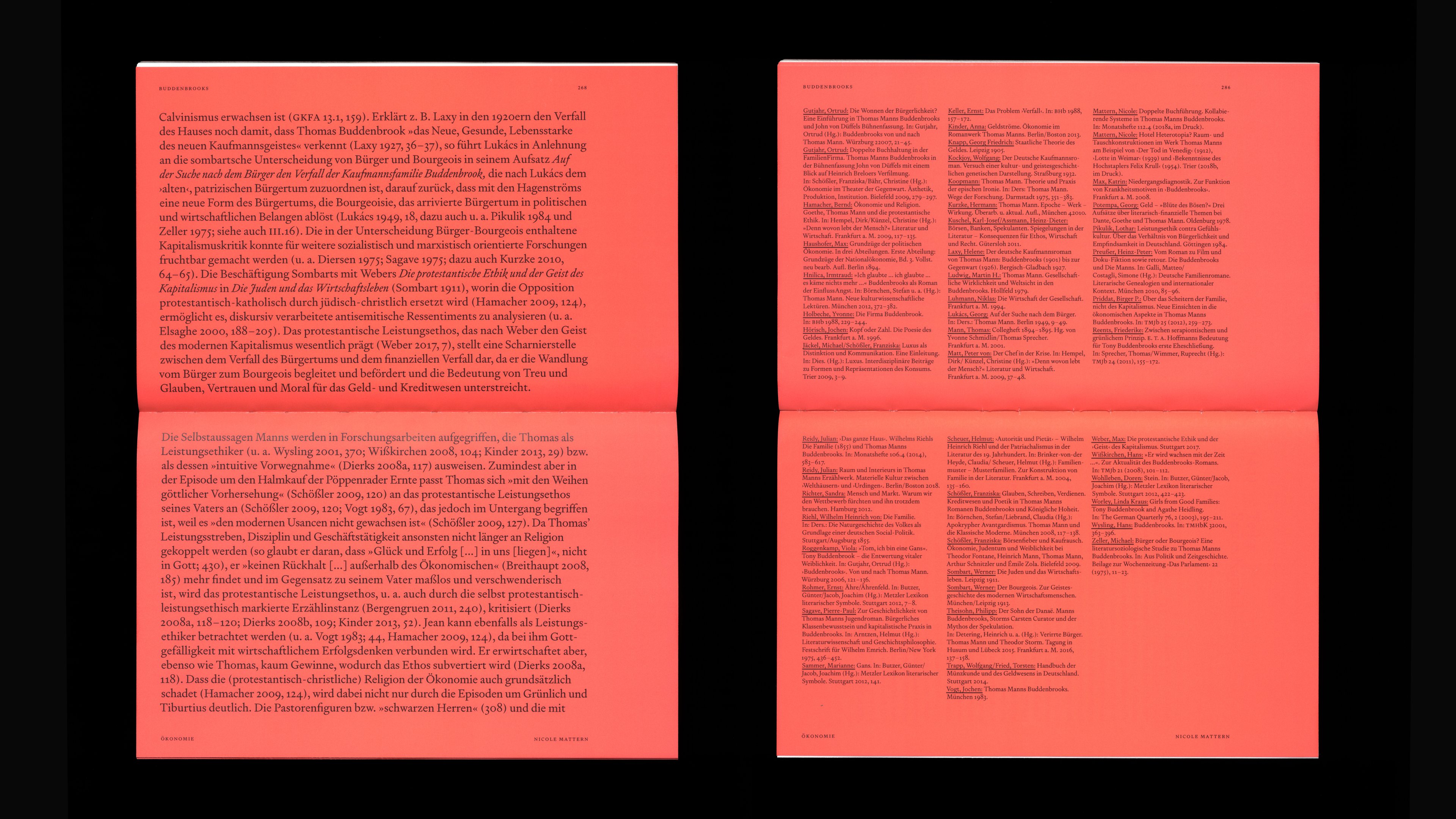
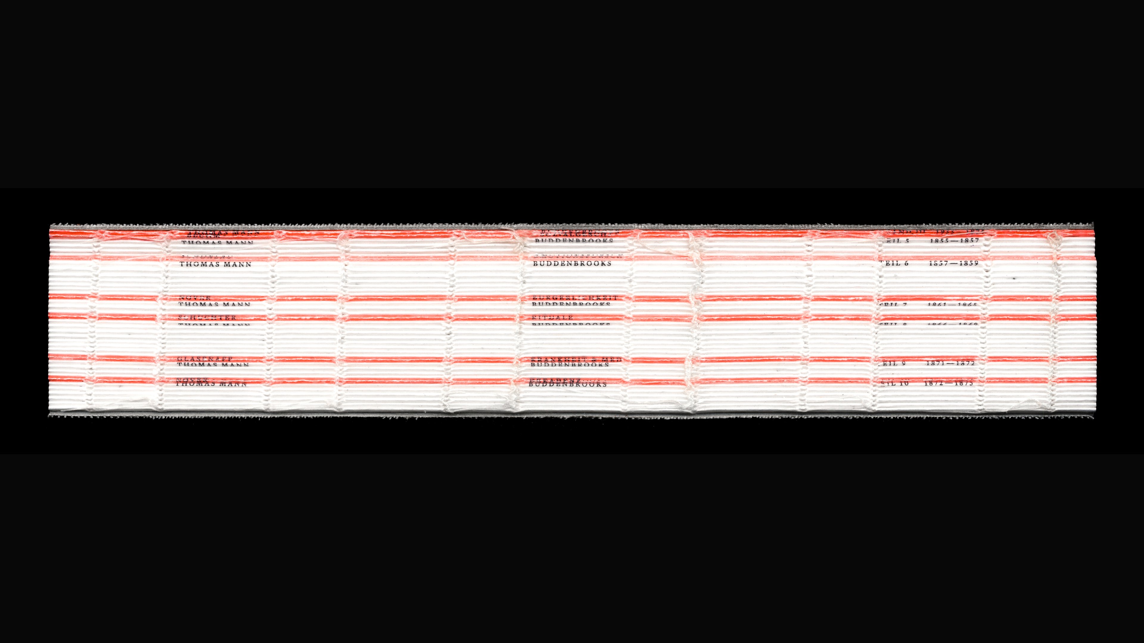
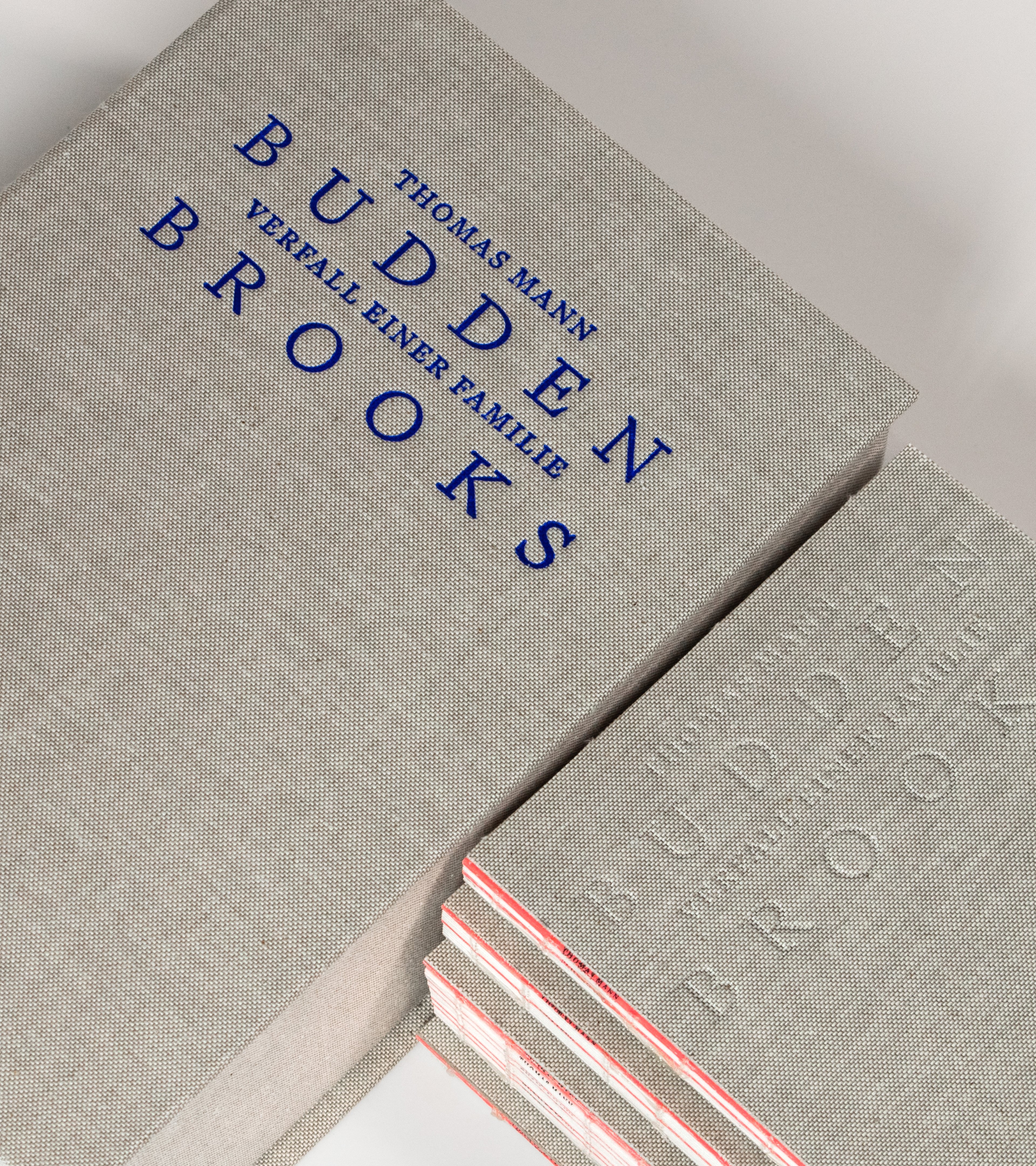
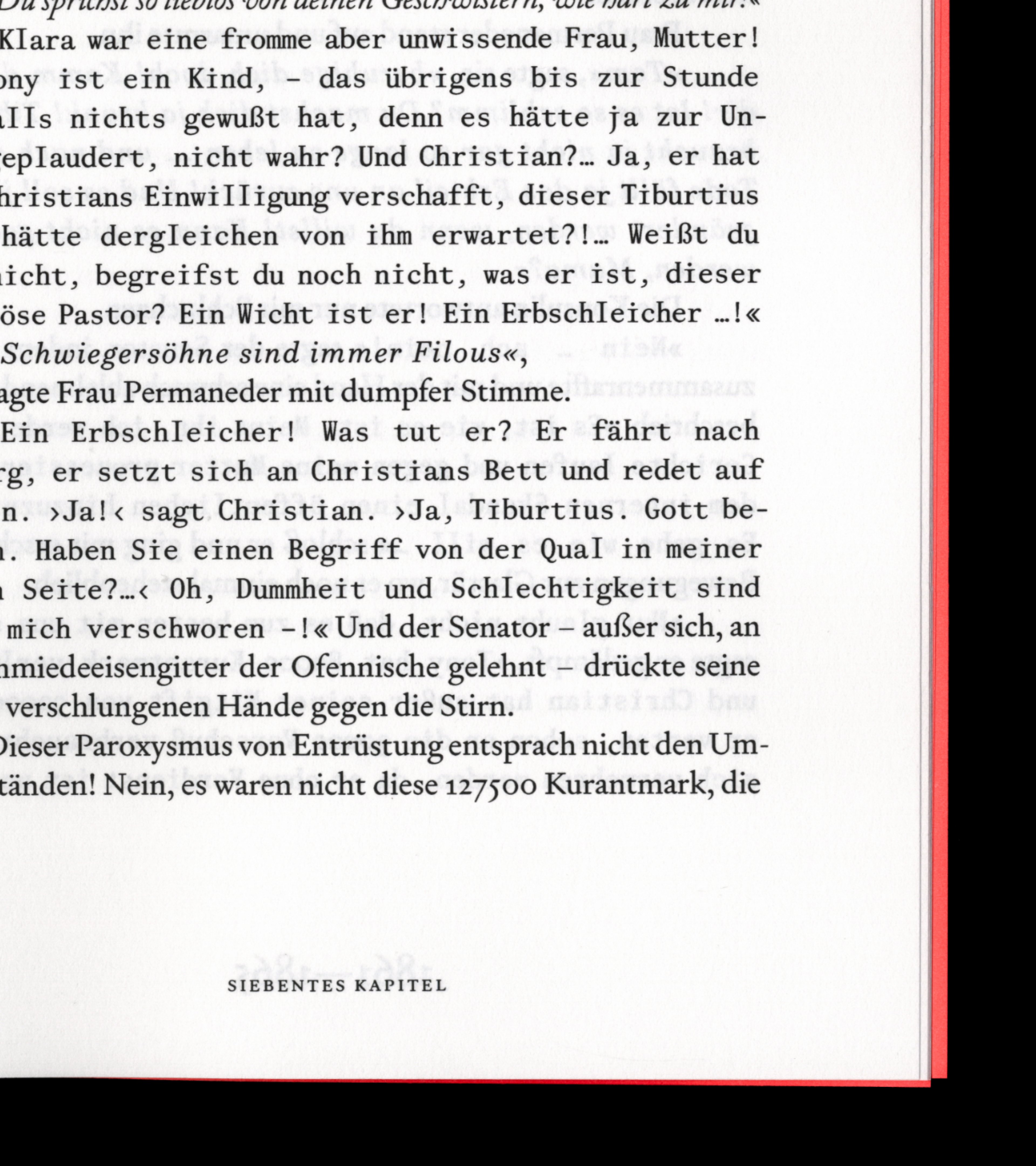
The typographical system in the new edition of “Buddenbrooks” uses different type styles to distinguish between characters. Twelve different typefaces that represent the principal characters throughout the book are constantly clashing with each other, underlining the conflict-ridden family dynamics, quarrels, and diametrically opposed personalities. Consequently, the typography of the novel emerges as an expressionistic vessel of information.
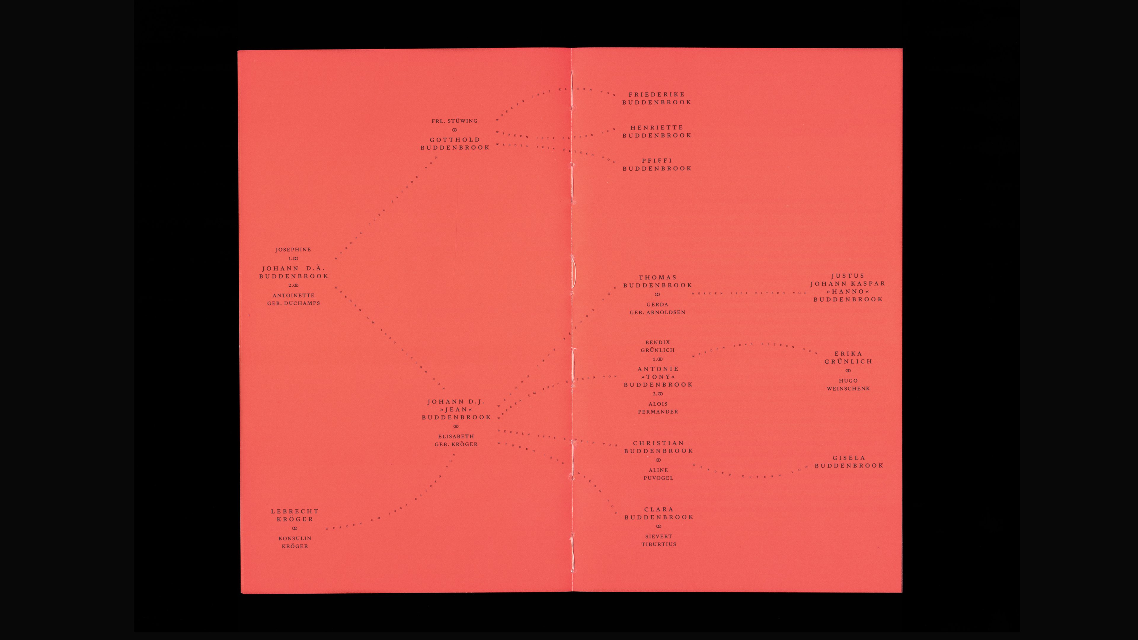
The typographic system is further built around the idea of ancestral lineage—the type characters are all related to each other in at least one characteristic element. The implementation of character-specific formatting occurs whenever direct speech is encountered. This understanding of typography is directly founded in the parallels of typeface families and human families. Similar to a human family—a union of individuals that are not necessarily blood-related but held together by shared parameters like love, respect, or culture—a type family shares at least one common parameter while differing in others.
Controls space
Controls space
Controls space
Controls space
![]() /
/ ![]()
For example, The Oldest Buddenbrook patriarch is set in a classicist serif, representing stability and harmony and highlighting his conservative personality. The typeface chosen for his son still draws on the classicist characteristics but becomes higher in line contrast and looks a bit more forced — he is willingly following his father’s footsteps, though his role as merchant starts to become a performative act. The grandson is also taking over the family business. However, it becomes evident that he experiences discontentment in conforming to the role that his family expects him to fulfil. As a result, his type character is still a high-contrast serif but becomes mono-spaced—mirroring the confinement he endures due to his predetermined societal position. Consequently, this typeface ceases to be a well-balanced serif, showing moments of awkwardness characterised by uneven grey values. The great-grandson is emotionally fragile and utterly uninterested in the family business. As a result, his type character is radically shifting to a sans serif, though the pronounced stroke contrast still alludes to his ancestral ties.
This approach confirms the impact of typography on content and how it can effectively enrich comprehension and offer supplementary information that readers can instinctively grasp. Typography is a crucial instrument in conveying the intricacies of content. Family dynamics and points of conflict become perceptible through typographic expression alone — without the need for reading — unveiling a visual representation of the core message.
Besides its topical family narrative, the book serves as a manifesto of “pluralistic typography”, emphasising the significance and drawing out the possibilities of how typography can reinforce the personalities of diverse characters and the connections between them.
Celebrating awkwardness
By emphasising the individuals of a family, we’re able to portray how this social constellation can look more diverse … can actually look as diverse as it is. So in the discussion of what a family is—here represented in “Buddenbrooks”—we’re able to support the individual by visually distinguishing the exceptional from the conventional. It proves that it is possible to work with an unorthodox typographic system to underline and extend the meaning of the content in question and hopefully create a conversation around how we can widen not only the notion of a given concept but how we ought to work with different — seemingly not matching — typefaces. “Pluralistic typography”, as practised in this rendition of “Buddenbrooks”, establishes autonomous visual authorship. Celebrating diversity and individualism and embracing awkwardness.
About:
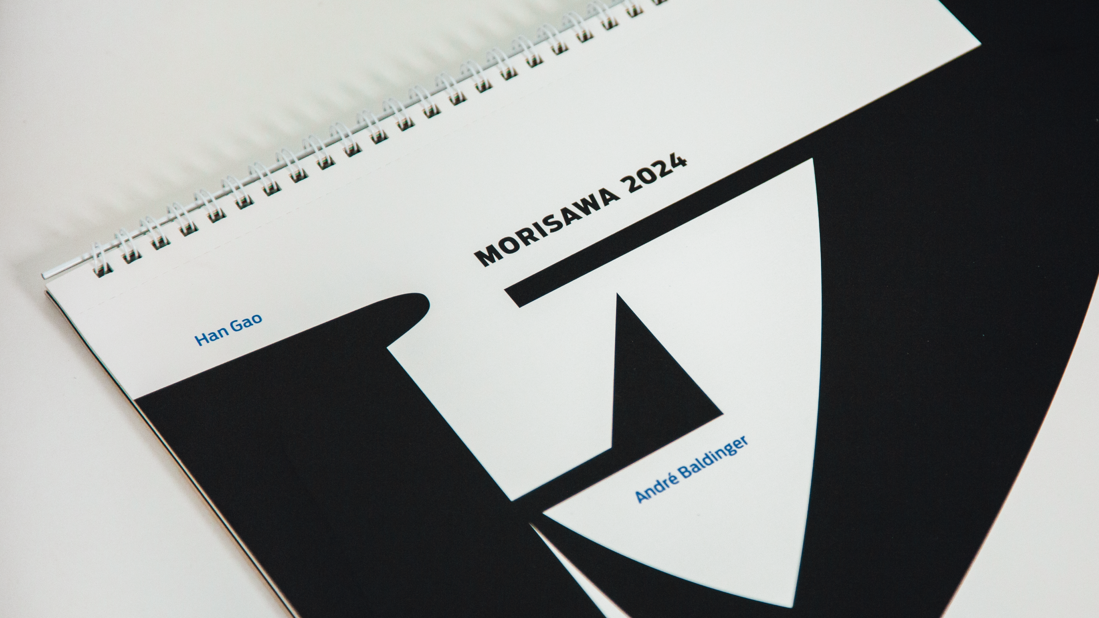
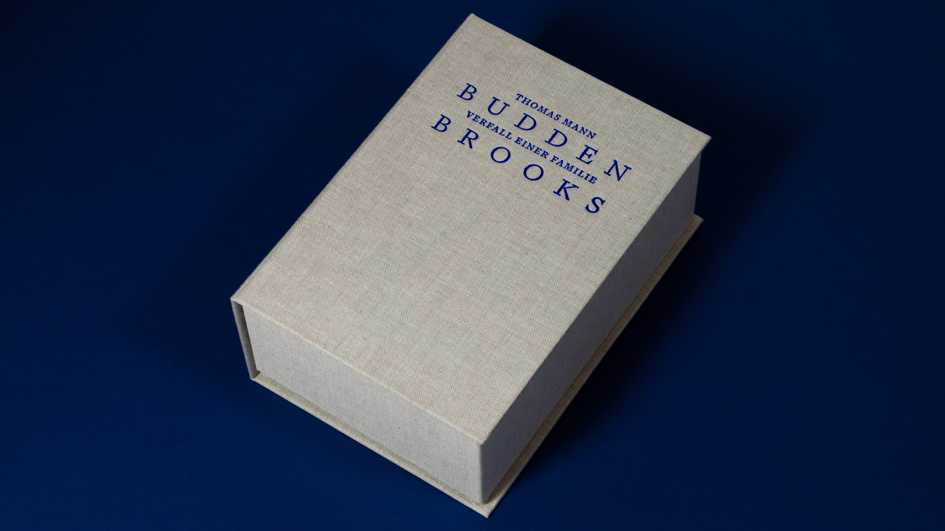
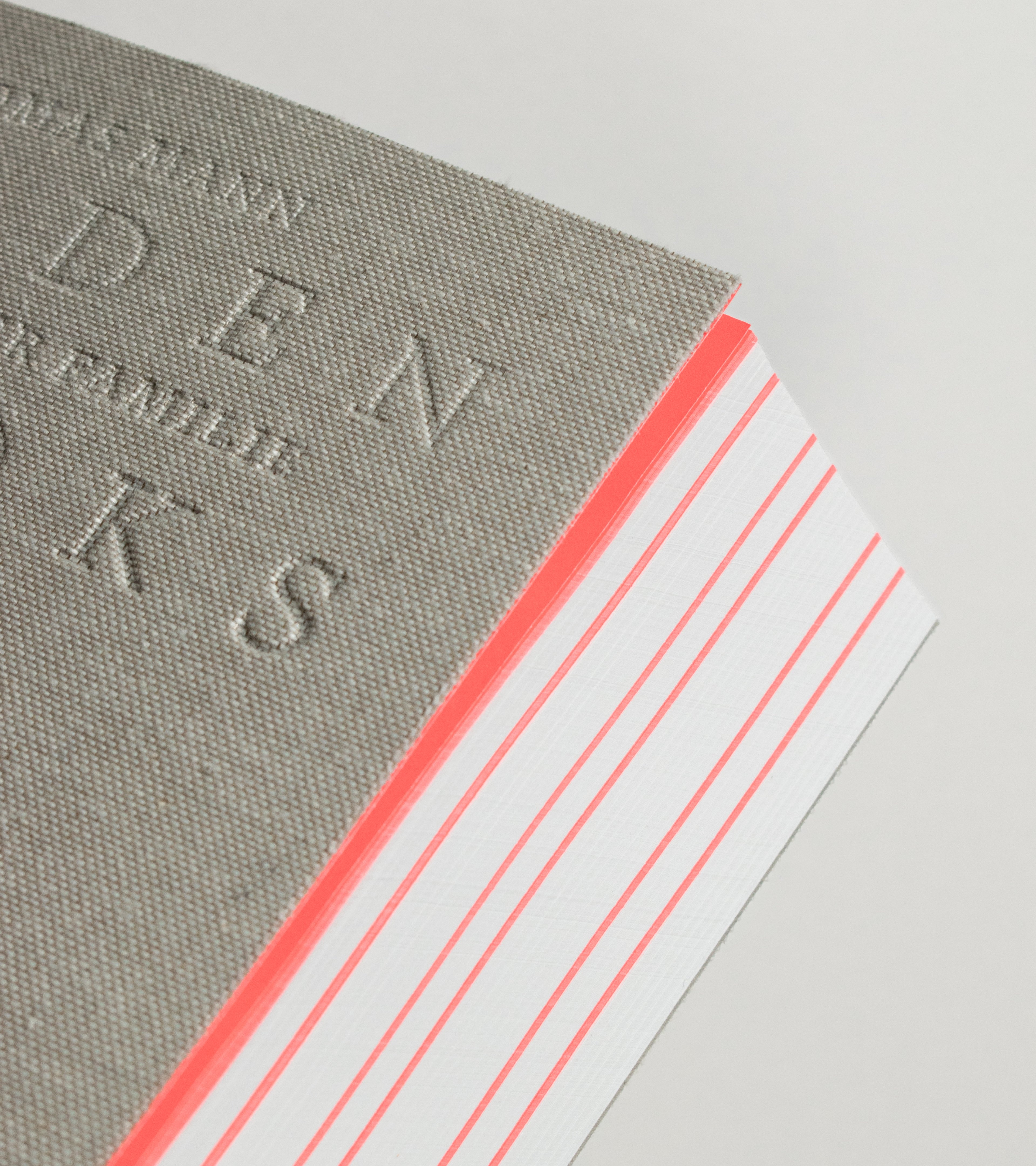
The new edition of “Buddenbrooks” was conceptualised and designed by Lucas Guizetti as his Master’s thesis project at the Royal Danish Academy. Feel free to contact Lucas, to get to read his whole thesis report, where he is going into detail about all his design decisions and is critically reflecting on the nature of the current design industry and the question of the moral validity of projects like “Buddenbrooks”, that he describes himself as “design escapism”.
Related stories